Infographic
America's Favourite Music Genres
A visual communication piece that turns music genre data into a clear, energetic infographic story.
Exploring Music Through Data
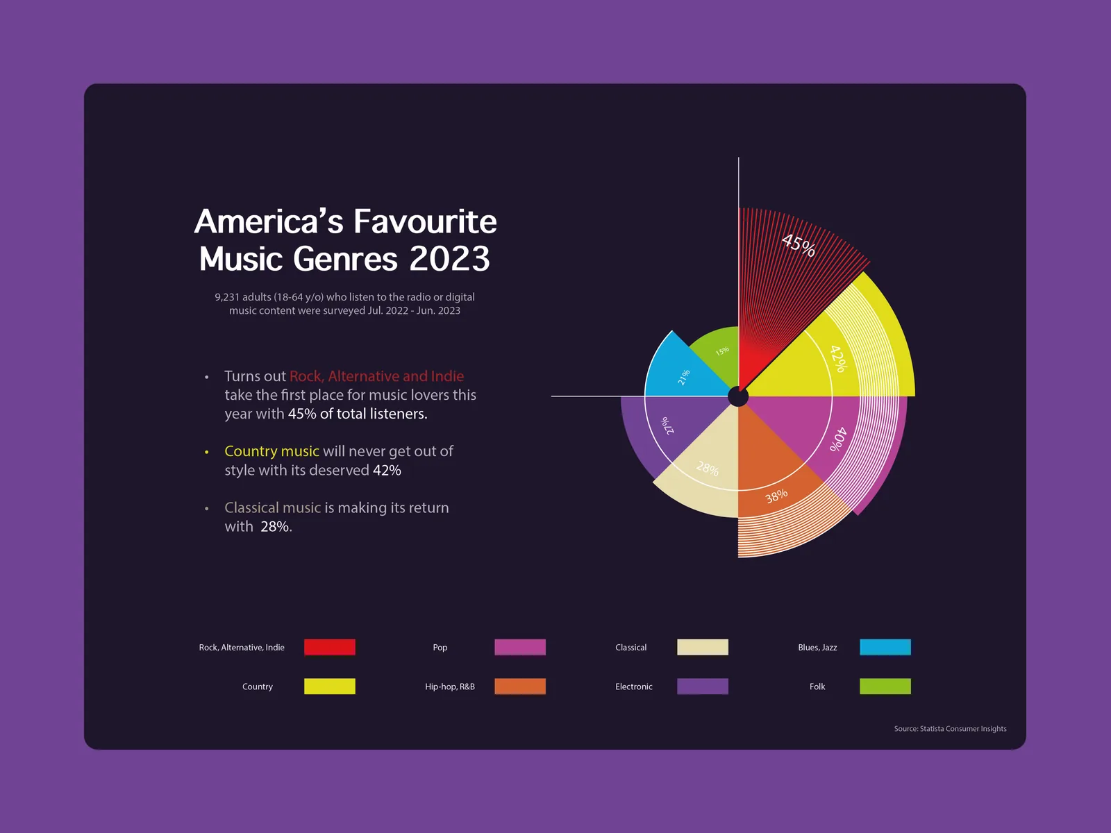
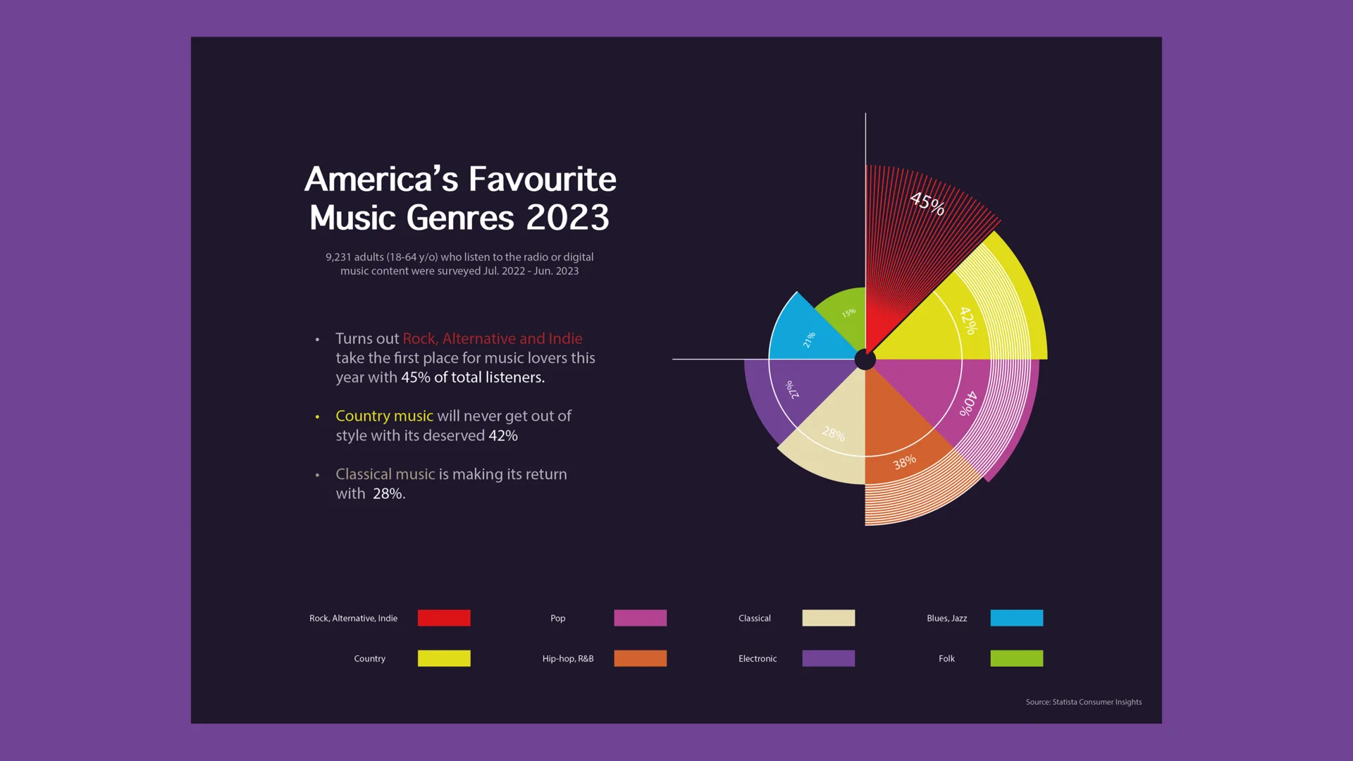
America’s Favourite Music Genres 2023 is an infographic project about turning music statistics into a clear visual story. The goal was to keep the data readable while giving the piece a stronger connection to music.
Time spent: 2 weeks
Improving a Working Concept
Many music infographics communicate data clearly, but they often rely on standard charts with little connection to the subject. I wanted the visual language to feel more musical without making the information harder to read.
Inspiration From Music Notation
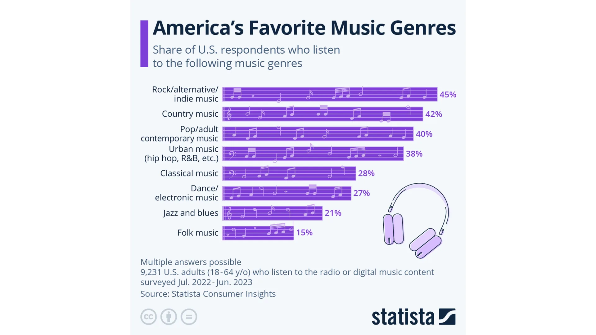
The concept takes inspiration from sheet music. Staff lines and note-like forms became part of the chart structure, connecting the theme directly to the data.
Balancing Information and Visual Appeal
The layout uses a clean vertical structure for scanning and comparison. Genres are ordered by popularity, so viewers can understand the ranking quickly.
Preserving Clarity
Color helps separate genres, but the chart remains the main focus. Typography and supporting text stay simple so the statistics are easy to understand.
From First Attempt to Final Solution
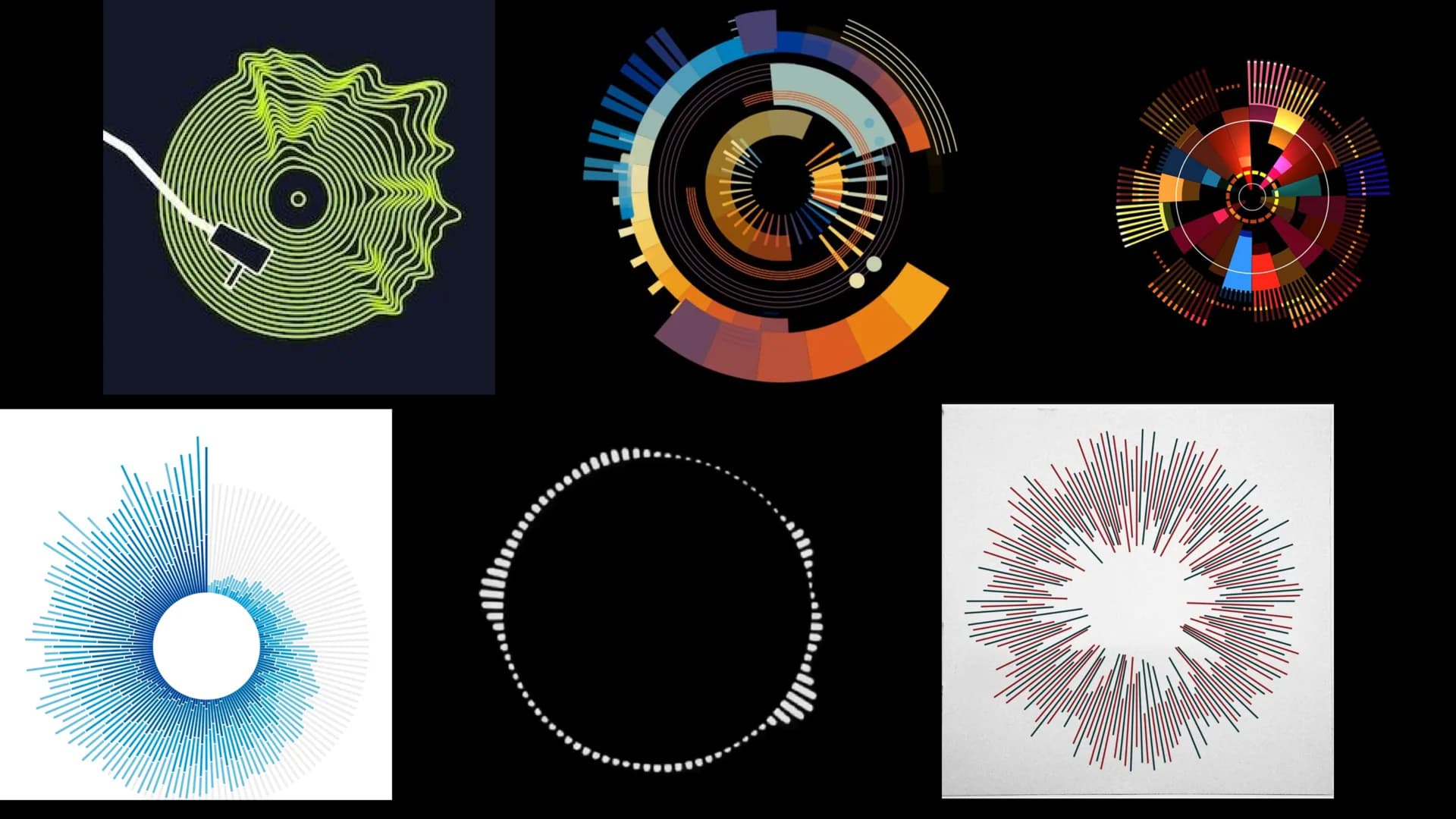
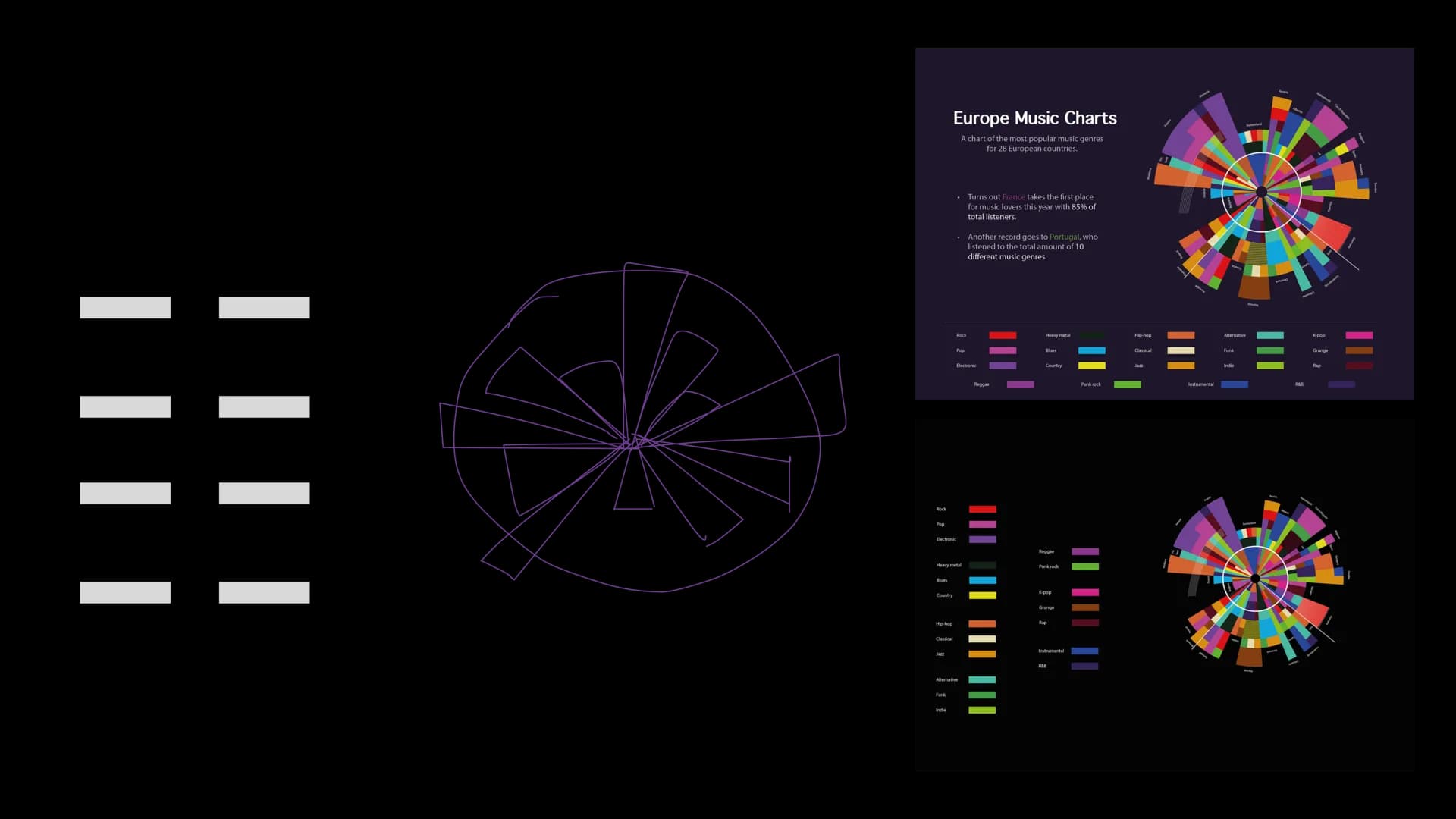
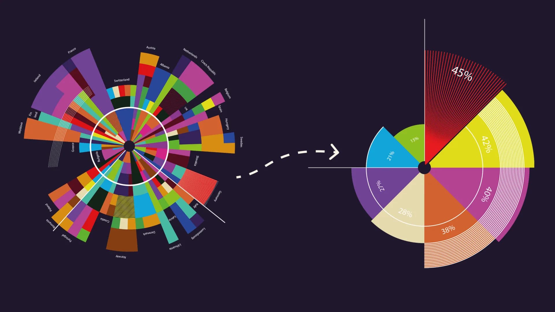
An earlier radial version felt energetic but became too complex. The final horizontal structure improved hierarchy and made relationships between values easier to read.
Balancing Creativity With Usability
This project taught me that visual ideas are strongest when they serve the information. The music theme works because it supports the chart instead of competing with it.