Branding
Sunset Song Bar
A warm bar identity built around music, sunset color, and a relaxed evening atmosphere.
Where Music Meets the Sunset
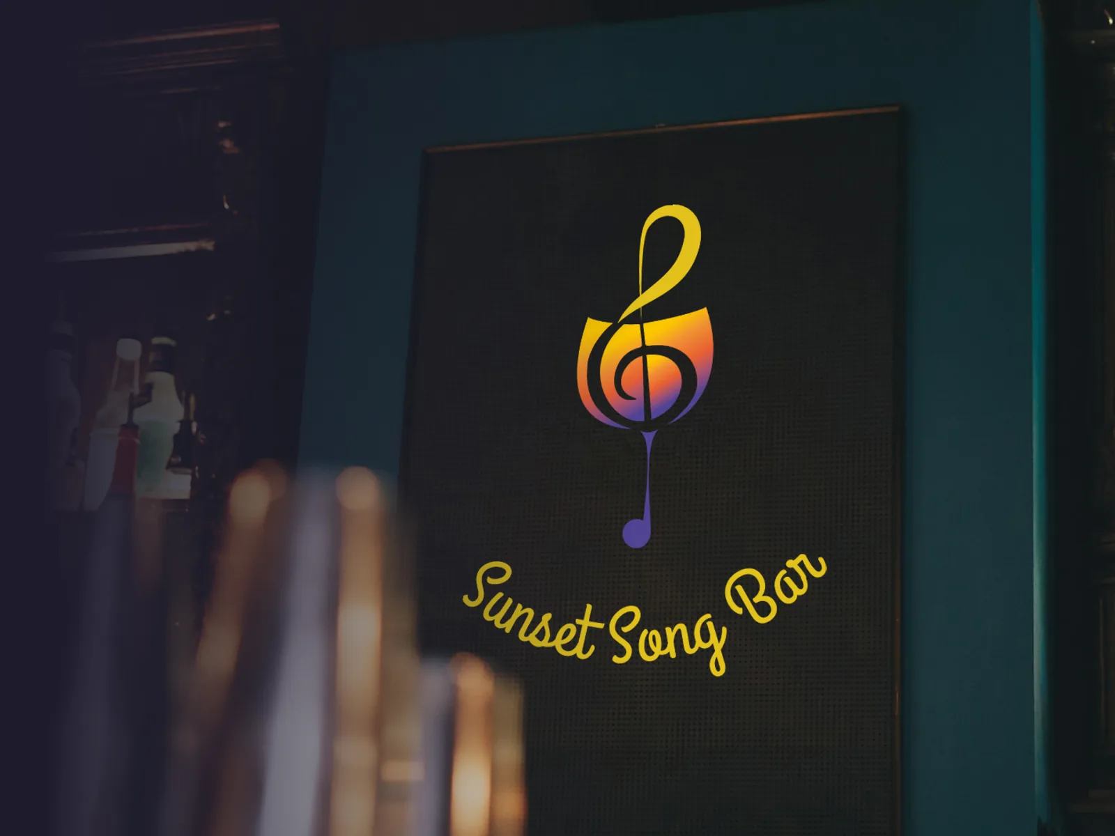
Sunset Song Bar is a fictional live-music bar identity. The project explores logo design, color, typography, and basic brand guidelines for a place built around evening music and relaxed social time.
Time spent: 3 weeks
A Logo for Evening Relaxation
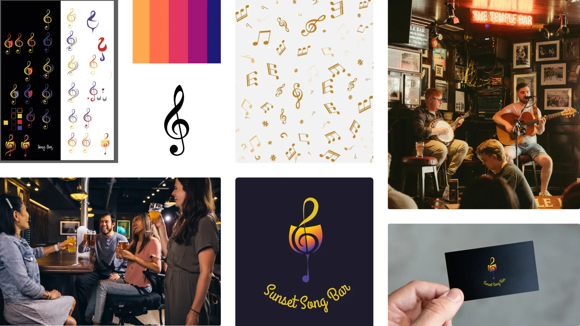
The moodboard focused on sunset color, soft evening light, music venues, and warm bar atmospheres. The brand needed to feel relaxed without becoming sleepy.
Connecting Music, Drinks, and Atmosphere
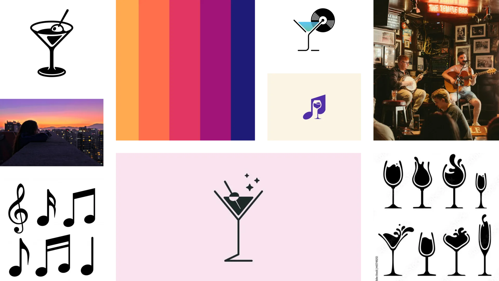
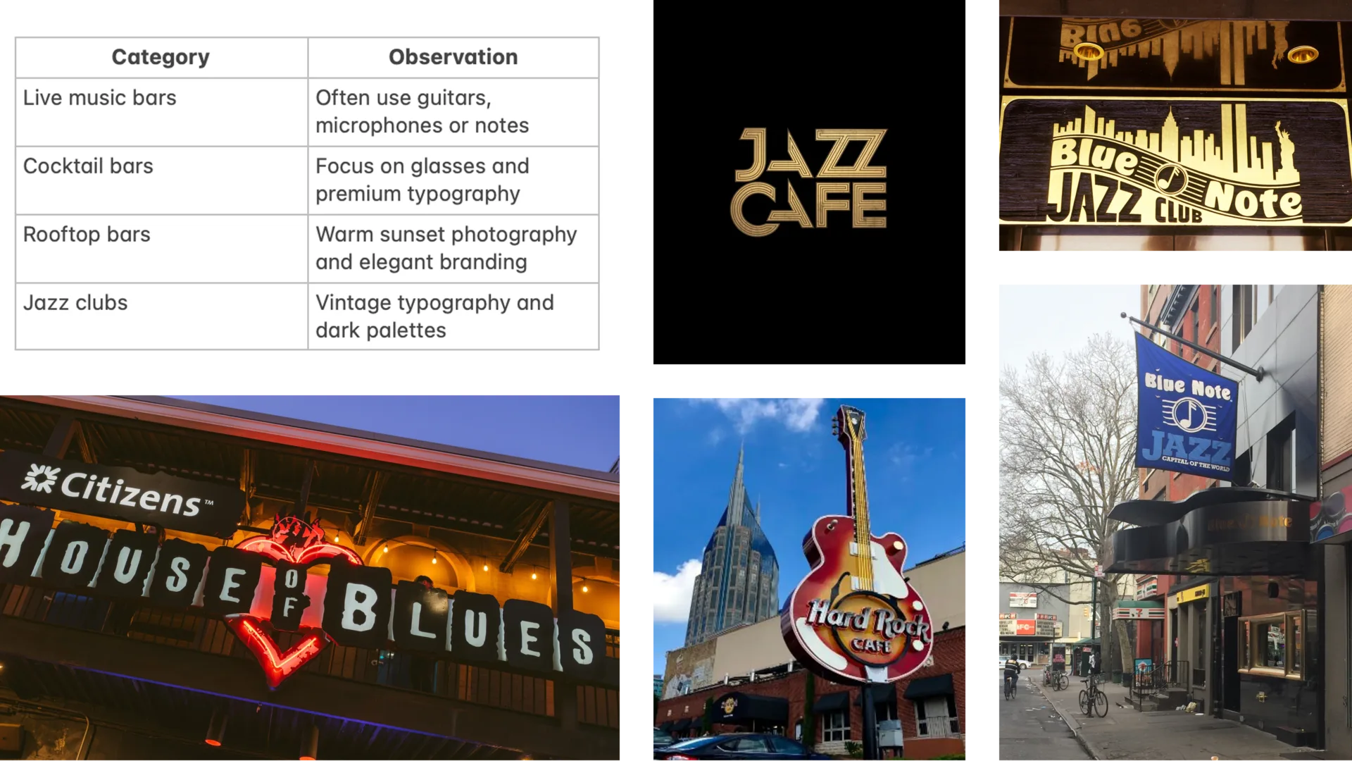
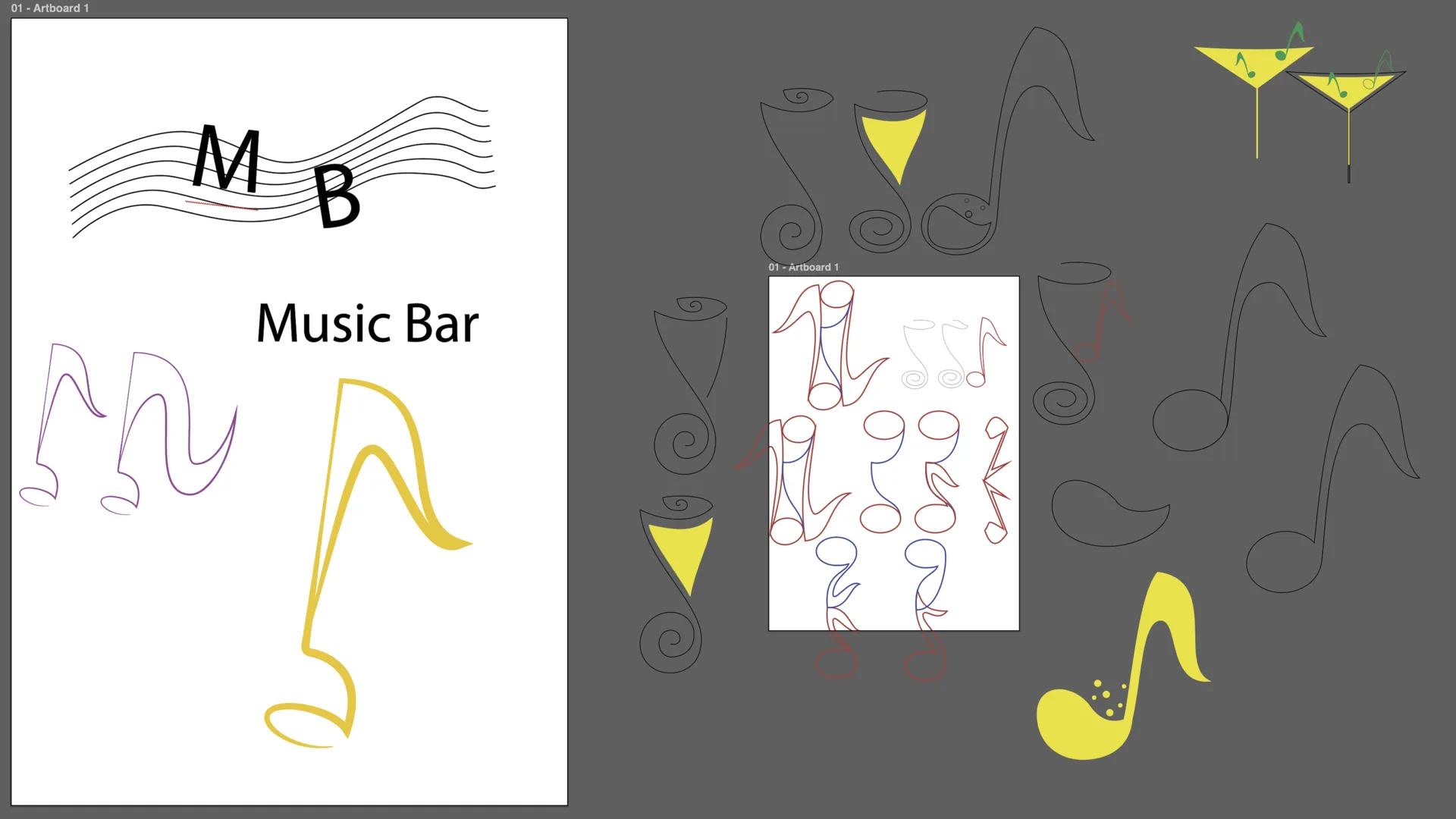
Competitor research showed many literal symbols: notes, guitars, cocktails, and neon signs. I wanted a solution that felt familiar but not generic.
Building the Symbol
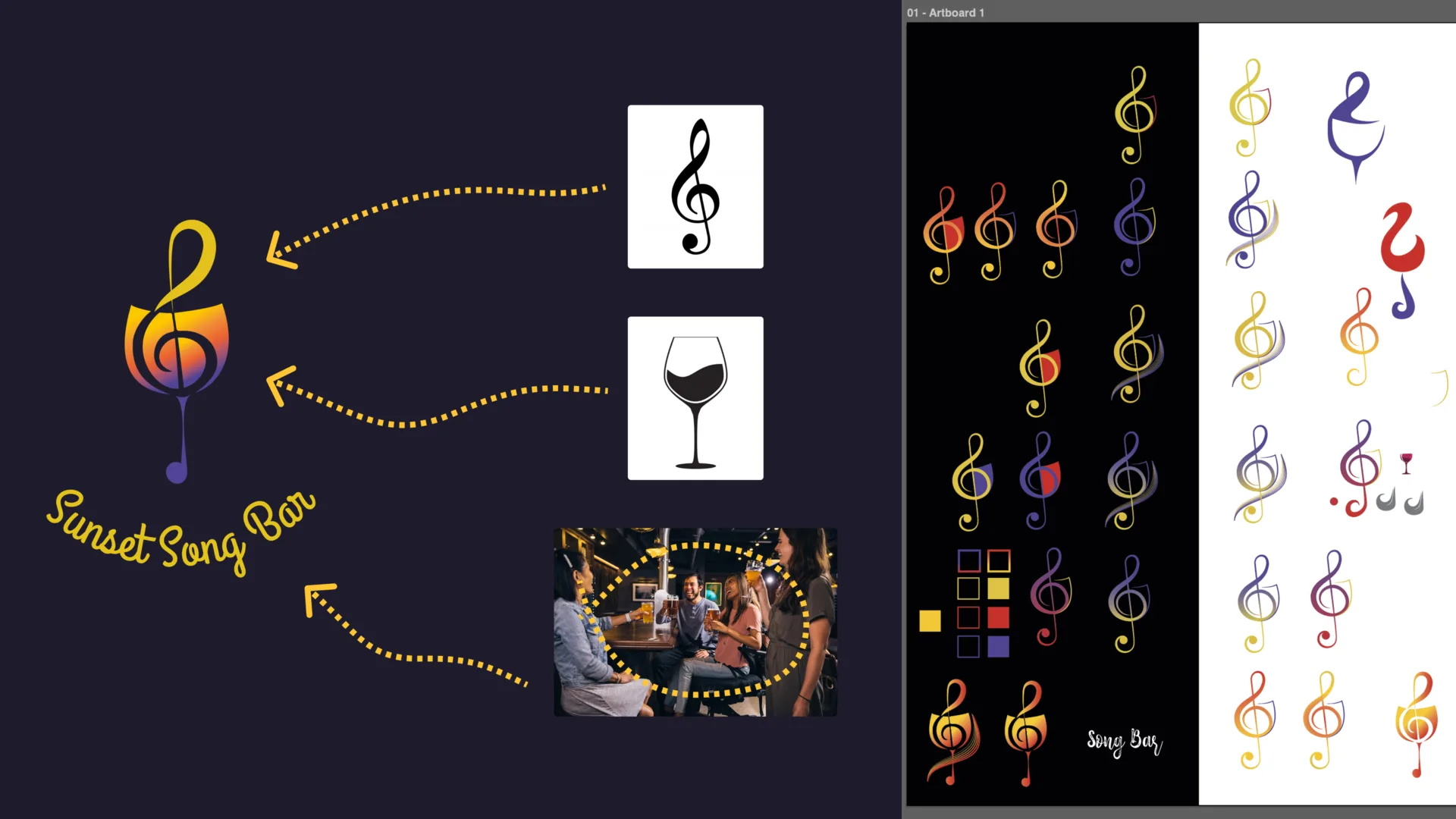
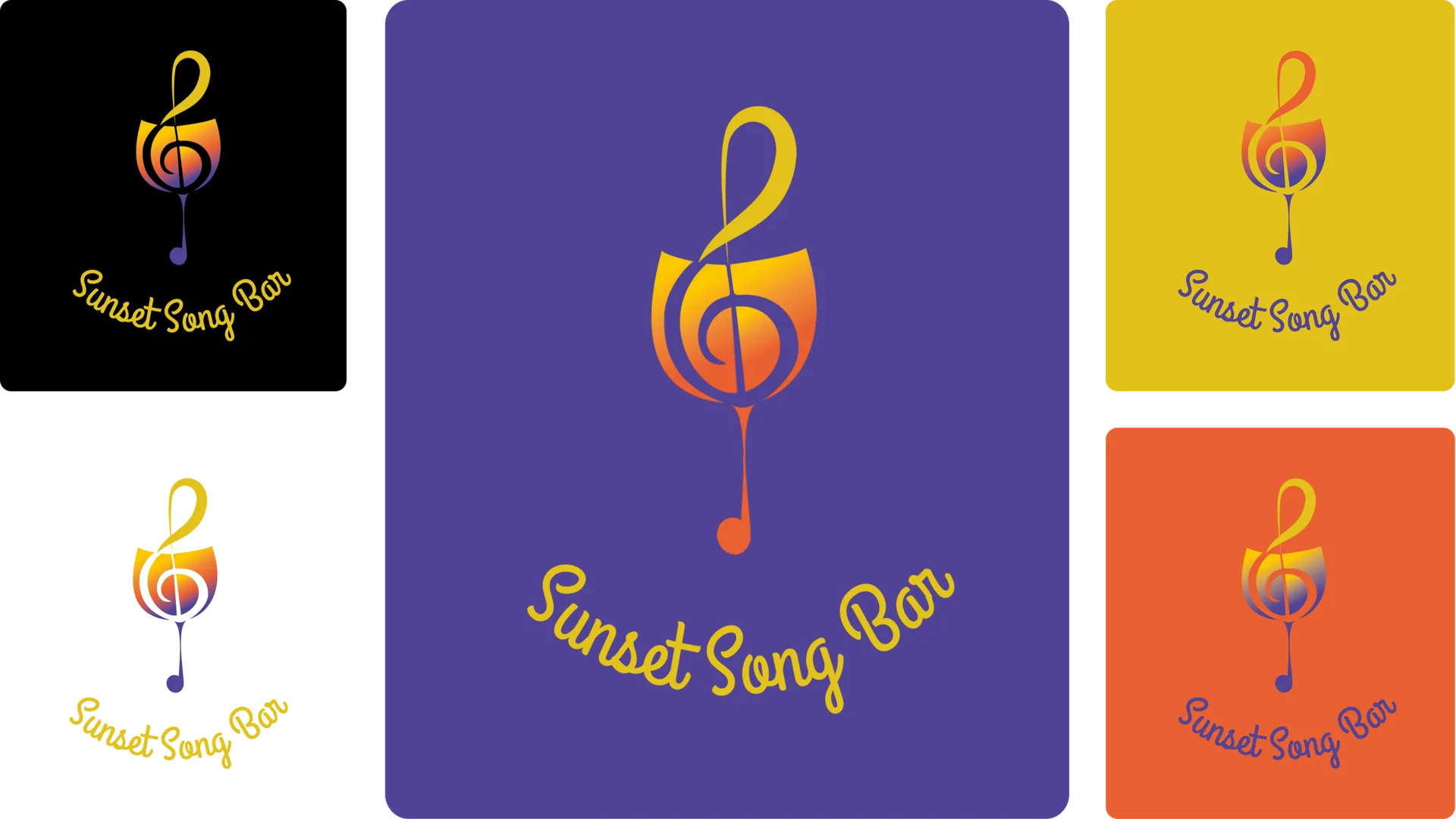
The logo combines a wine glass and a treble clef into one circular mark. It connects the bar setting with live music and hints at the shape of a setting sun.
Calm, Warm, and Recognisable
The color palette moves from yellow to orange to purple, echoing the transition from daylight to evening. It supports the idea of ending the day with music and company.
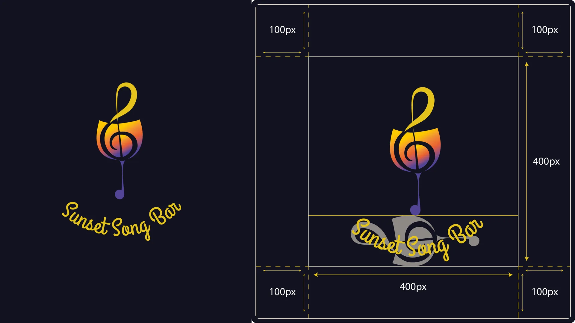
Building a Flexible Visual System
Safe zones, logo rules, and variations were defined so the identity could work across different formats without losing recognition.
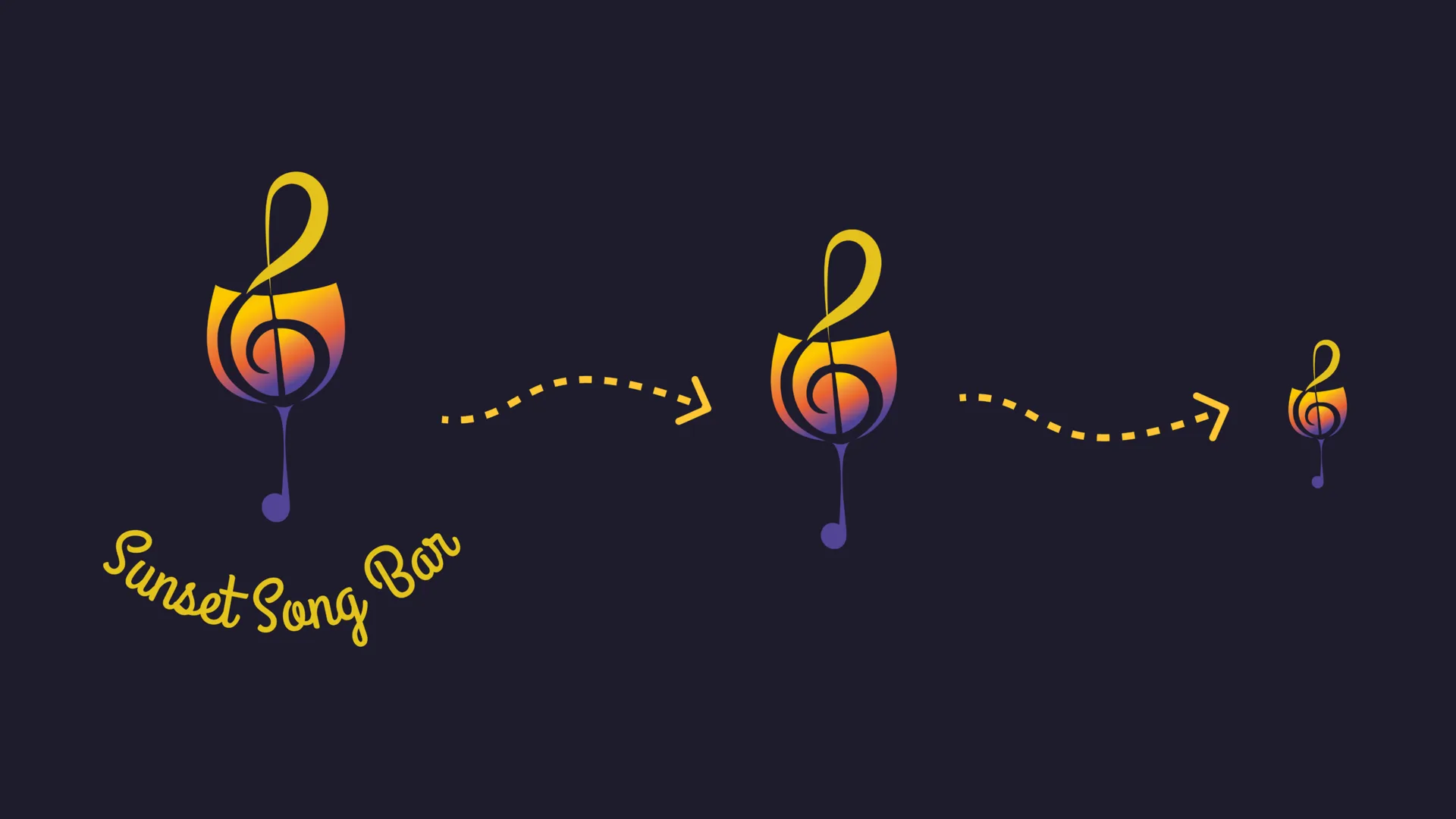
Testing Variations
The system includes multiple logo versions for different backgrounds and applications. This makes the identity easier to use in real situations.
Atmosphere as a Brand Asset
Backgrounds and supporting visuals extend the sunset idea beyond the logo. They give the brand a consistent mood for posters, menus, and digital use.
Testing Visibility in Real Applications
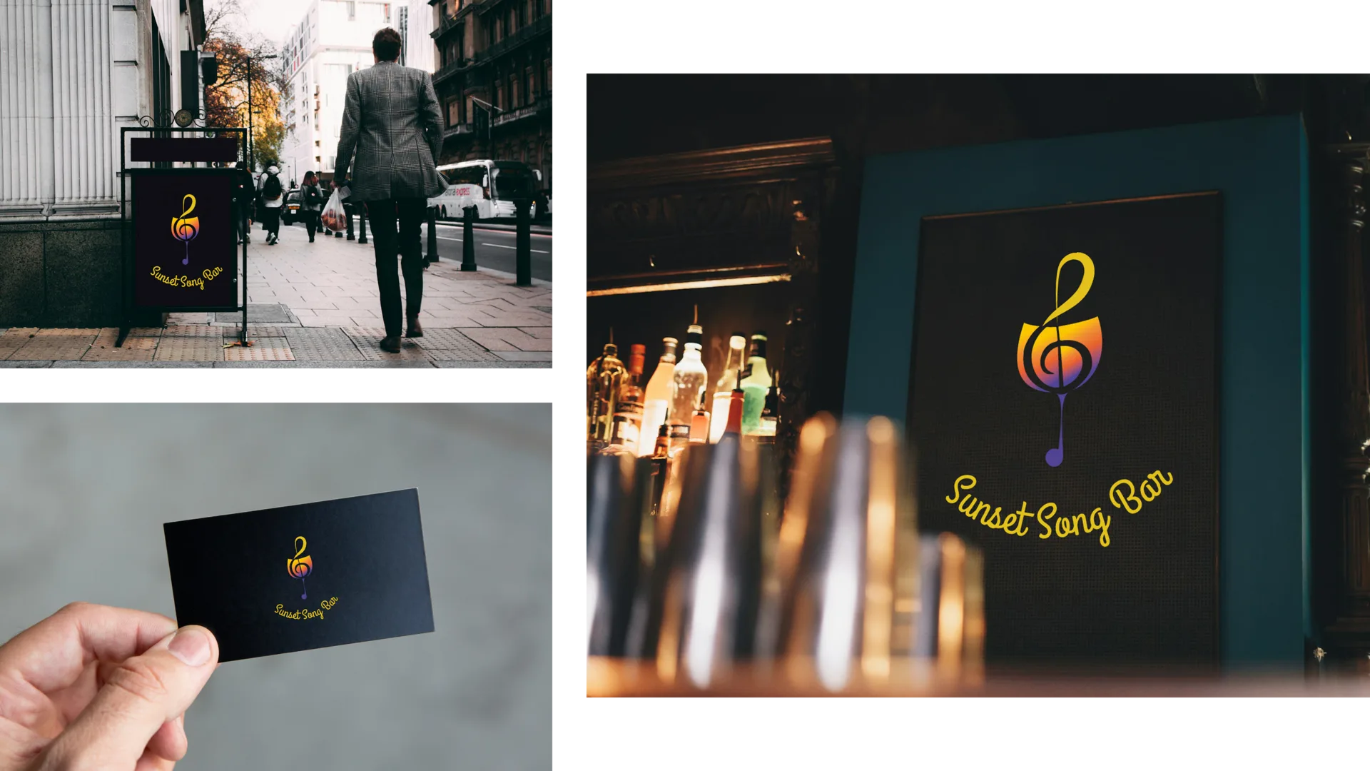
Mockups helped check whether the identity still feels clear and inviting when placed into realistic bar materials.
What I Learned About Brand Systems
This project helped me understand how a logo becomes stronger when it is supported by color, spacing, variations, and a clear atmosphere.