Author Brand
Terry Frost
An author brand concept that gives a literary voice a memorable, flexible visual identity.
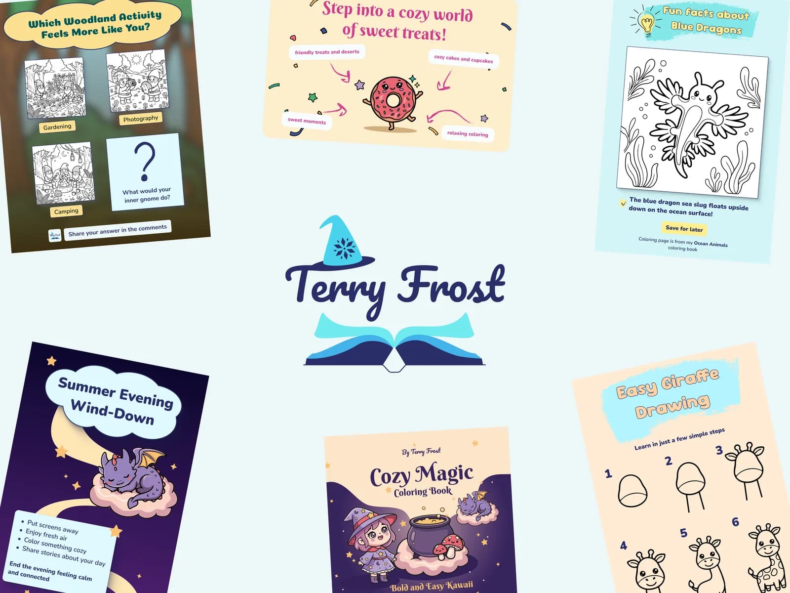
More Than a Coloring Book
Terry Frost is a brand identity and content strategy project for an independent coloring book author publishing through Amazon KDP. The work covered identity, positioning, social media planning, and long-term content direction.
Time spent: 2 months
What Can We Do Differently?
The project started with a practical question: how can a small independent author become recognizable before a reader even opens the book?
Understanding the Market
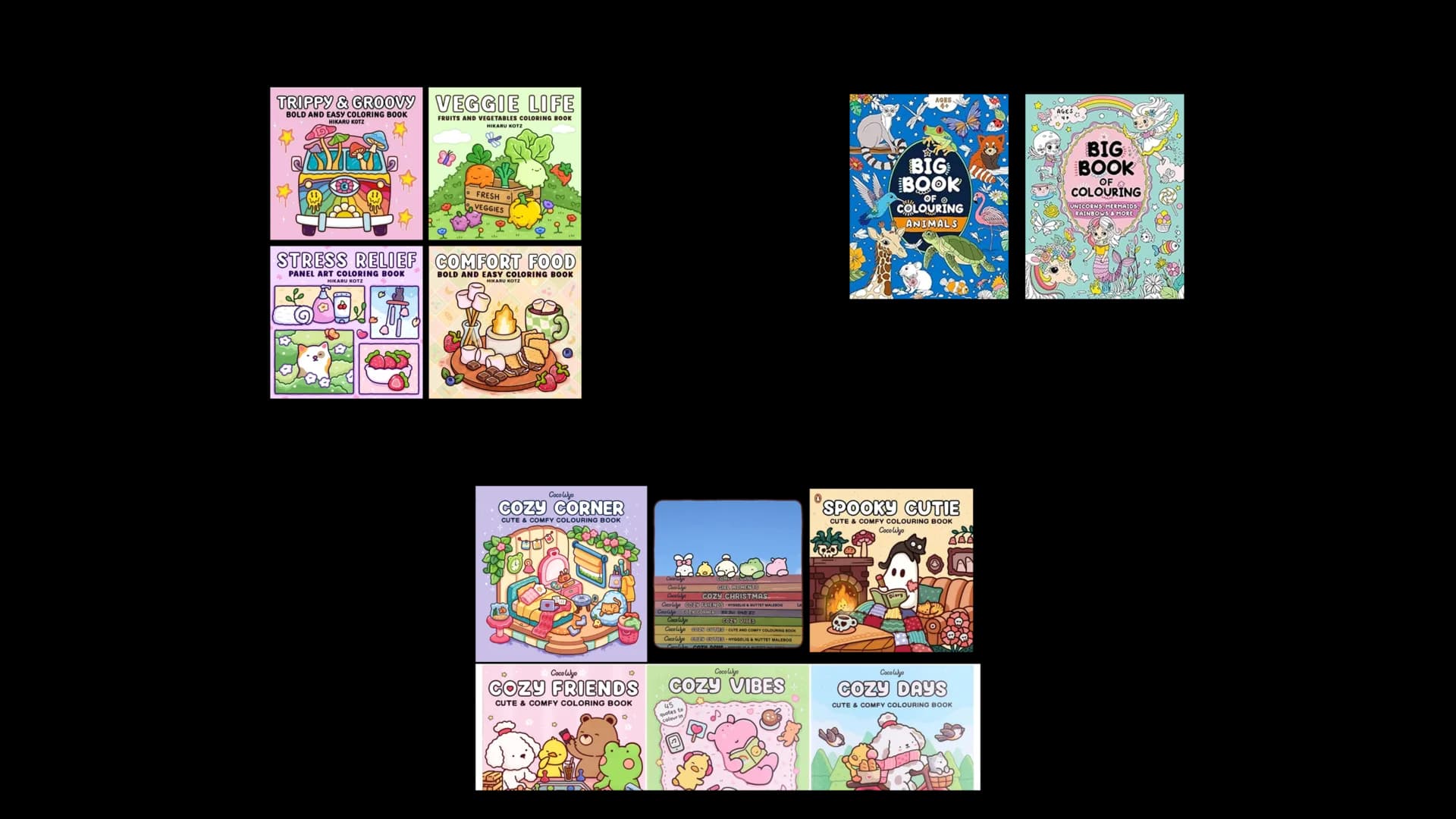
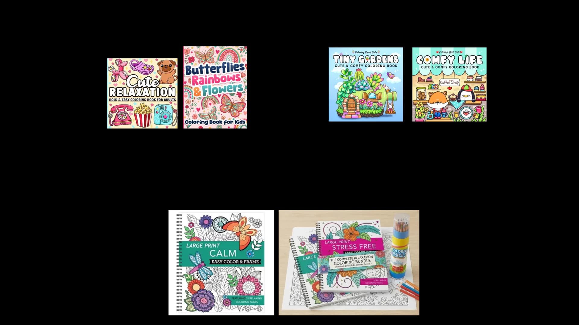
Competitor research showed that many coloring book brands rely on similar covers, similar promises, and similar social posts. That made distinct personality especially important.
Turning Constraints Into Opportunities
Amazon KDP has practical limits around format, production, and discoverability. Instead of treating those limits as obstacles, the strategy used them to focus the brand.
From Coloring Pages to Small Adventures
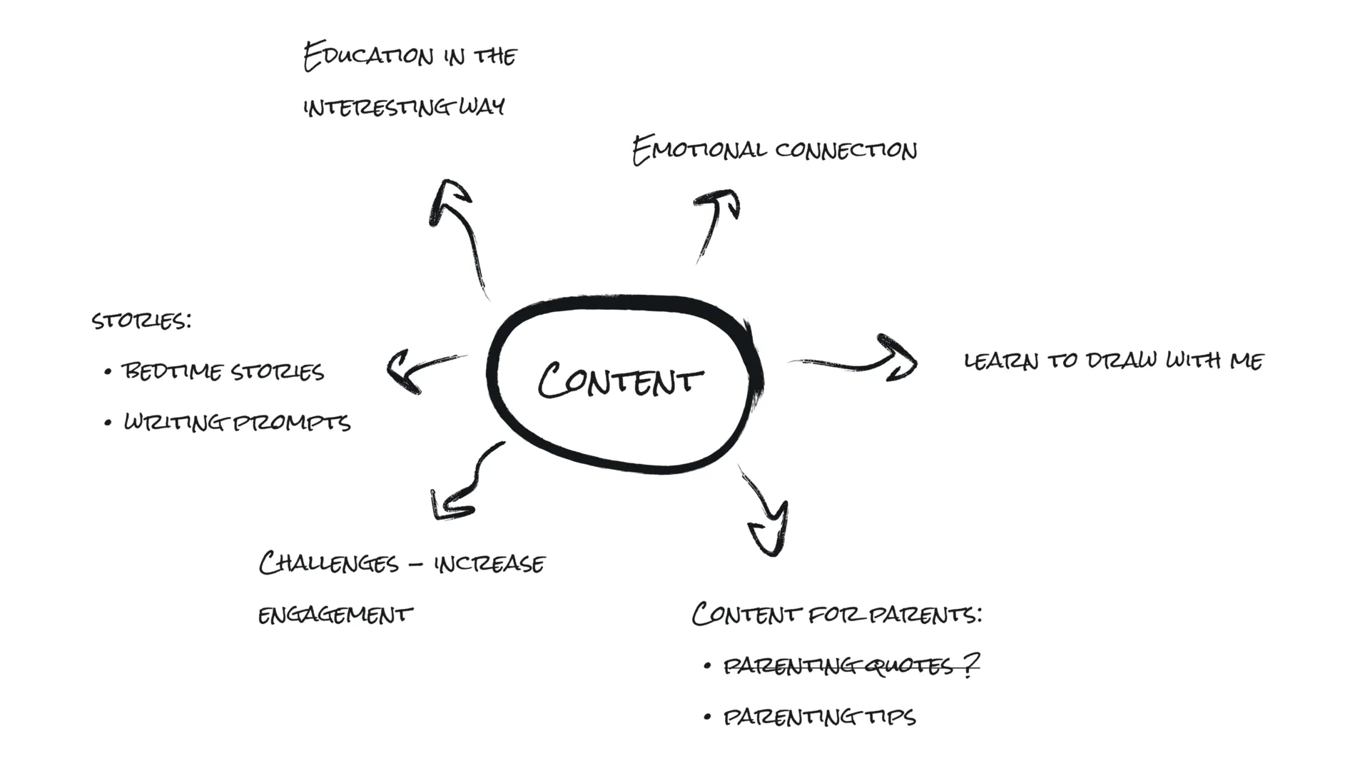
The content direction moved beyond showing finished pages. Posts were framed as small stories, prompts, routines, and cozy moments around the books.
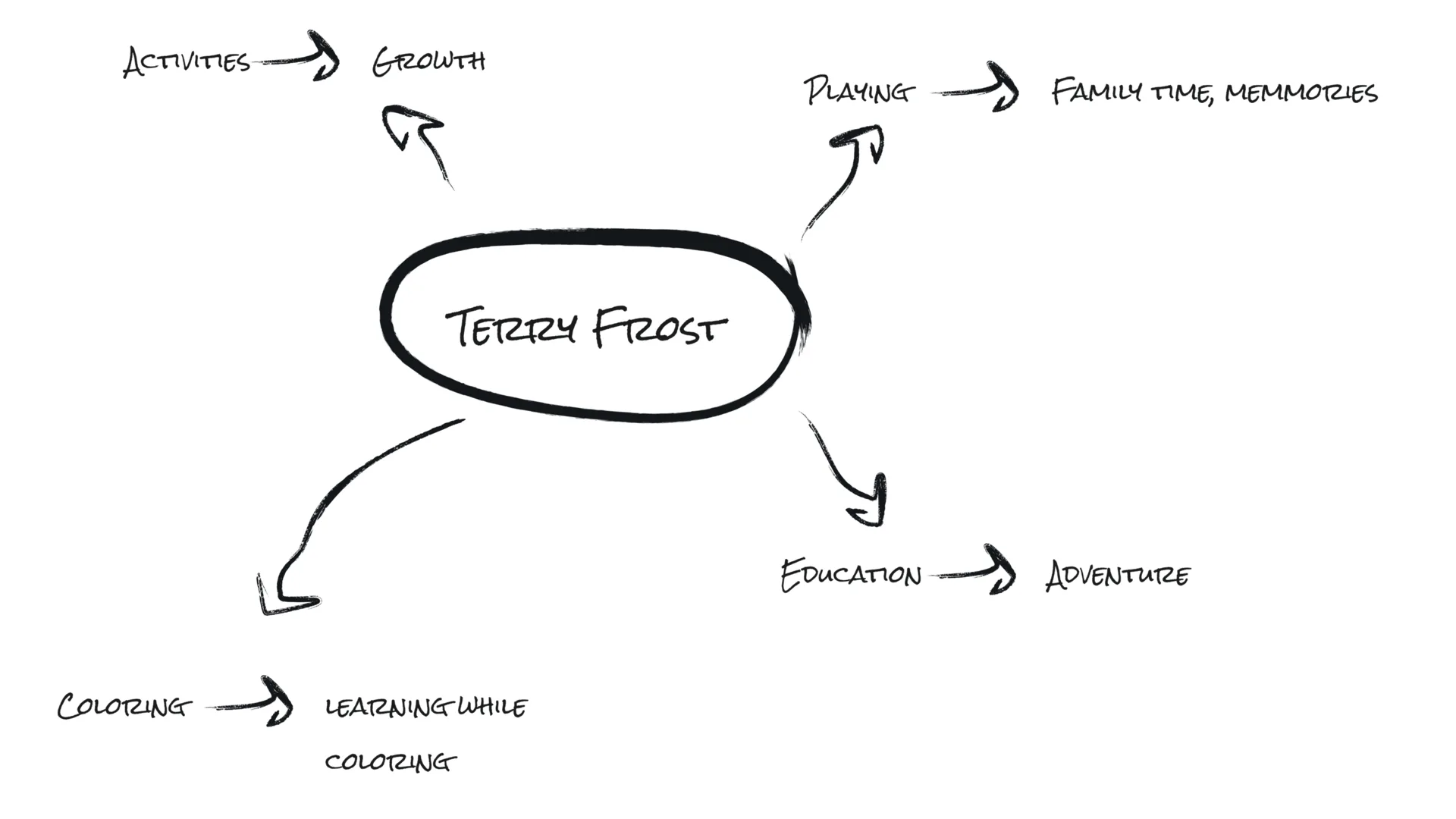
A Warm Identity for a Frost-Inspired Brand
The visual world combines soft fantasy, cozy color, and playful book imagery. It needed to feel friendly for children, but still charming enough for adults.

Building Recognition Through Symbols
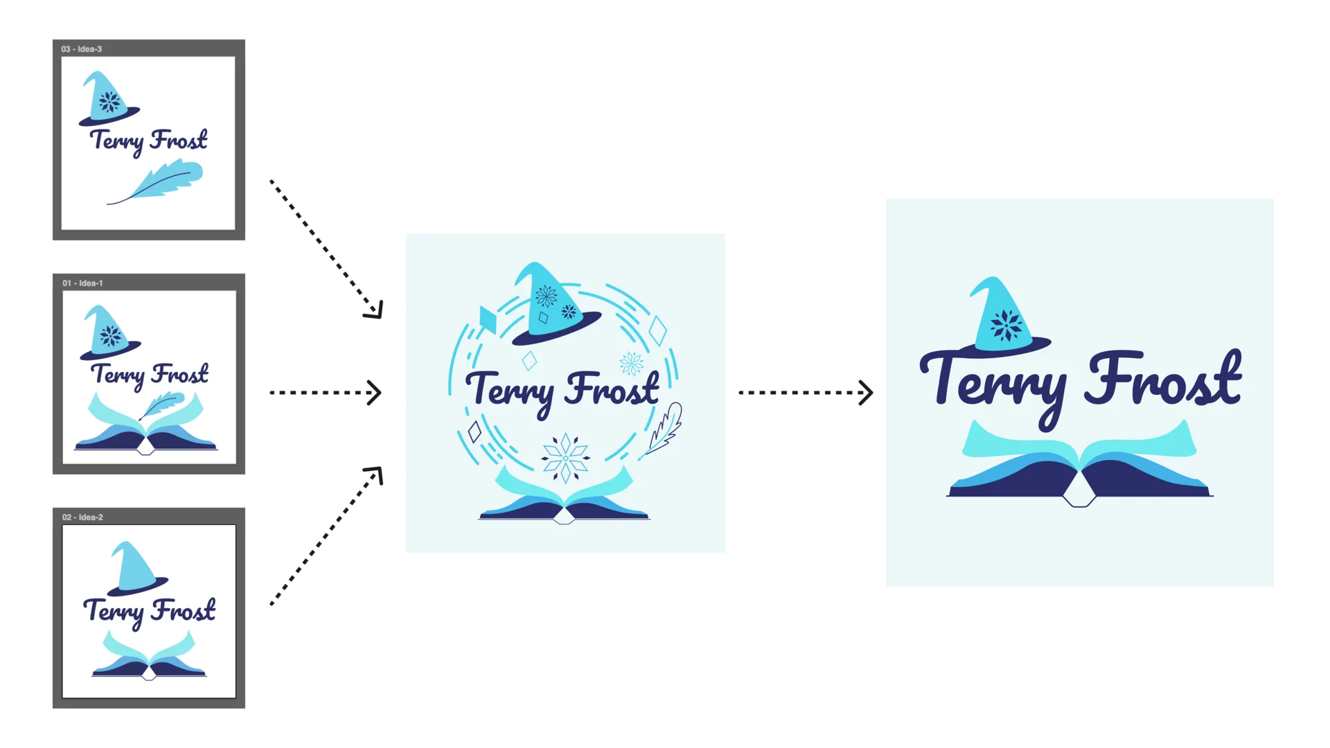
Moodboards helped shape the logo direction around magic, reading, and winter-like softness without making the brand feel cold.

A Flexible Author Mark
The final identity uses a mark that can work on books, pins, reels, and profile images. Flexibility mattered because the brand lives across many small surfaces.
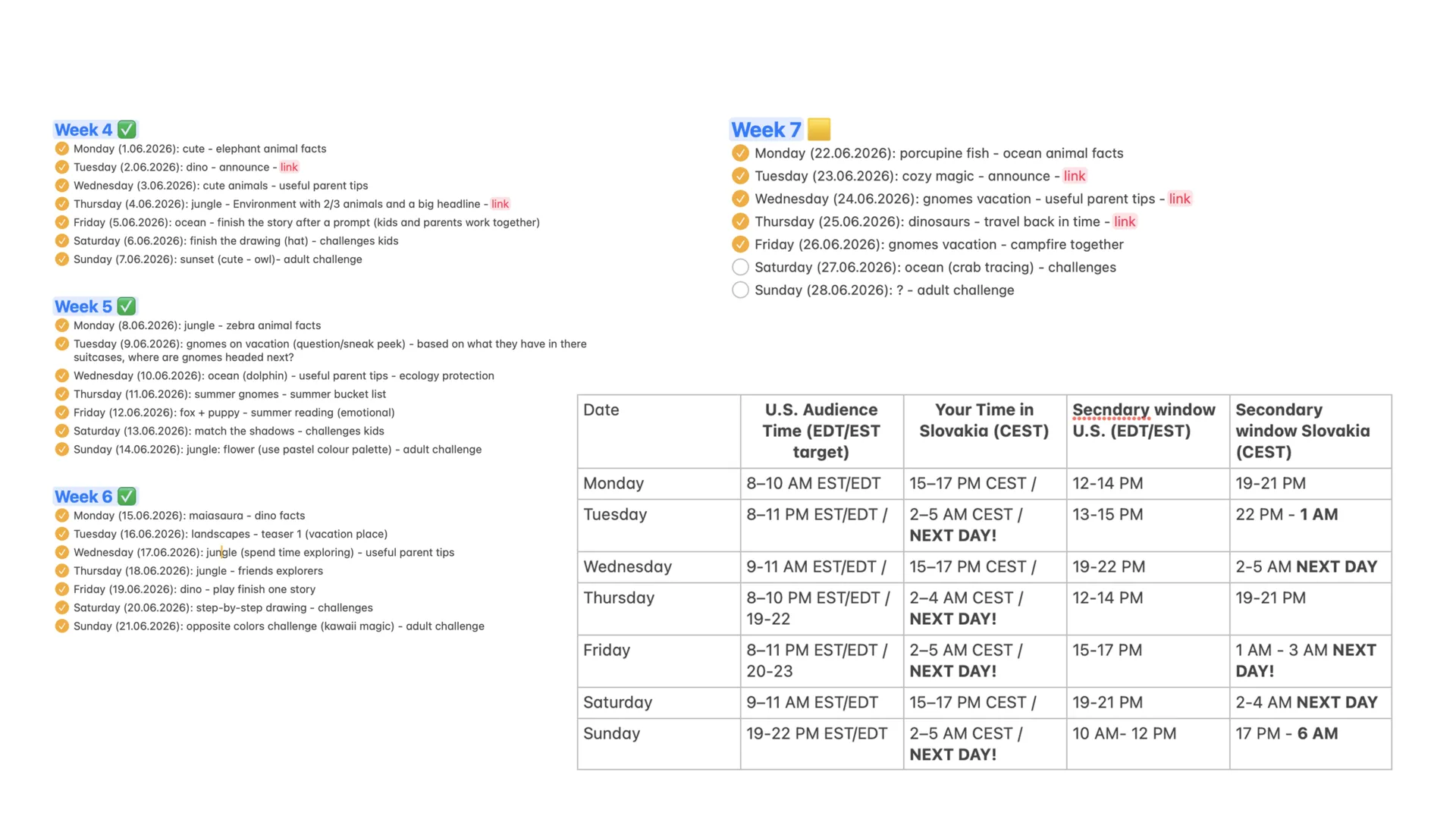
Growing a Social Media Presence
The social plan balanced Pinterest, Facebook, and short-form content. Each platform had a different role, but the tone stayed consistent.
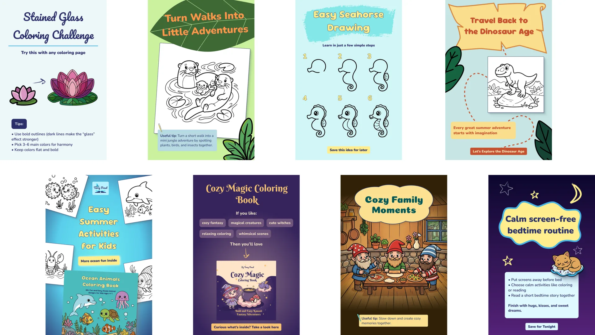
Pinterest as a Discovery Channel
Pinterest posts were tested through different formats: activity prompts, drawing ideas, book previews, and cozy story-led pins.
Facebook and Community Content
Facebook examples focused more on engagement, questions, and approachable visual prompts that invite comments.
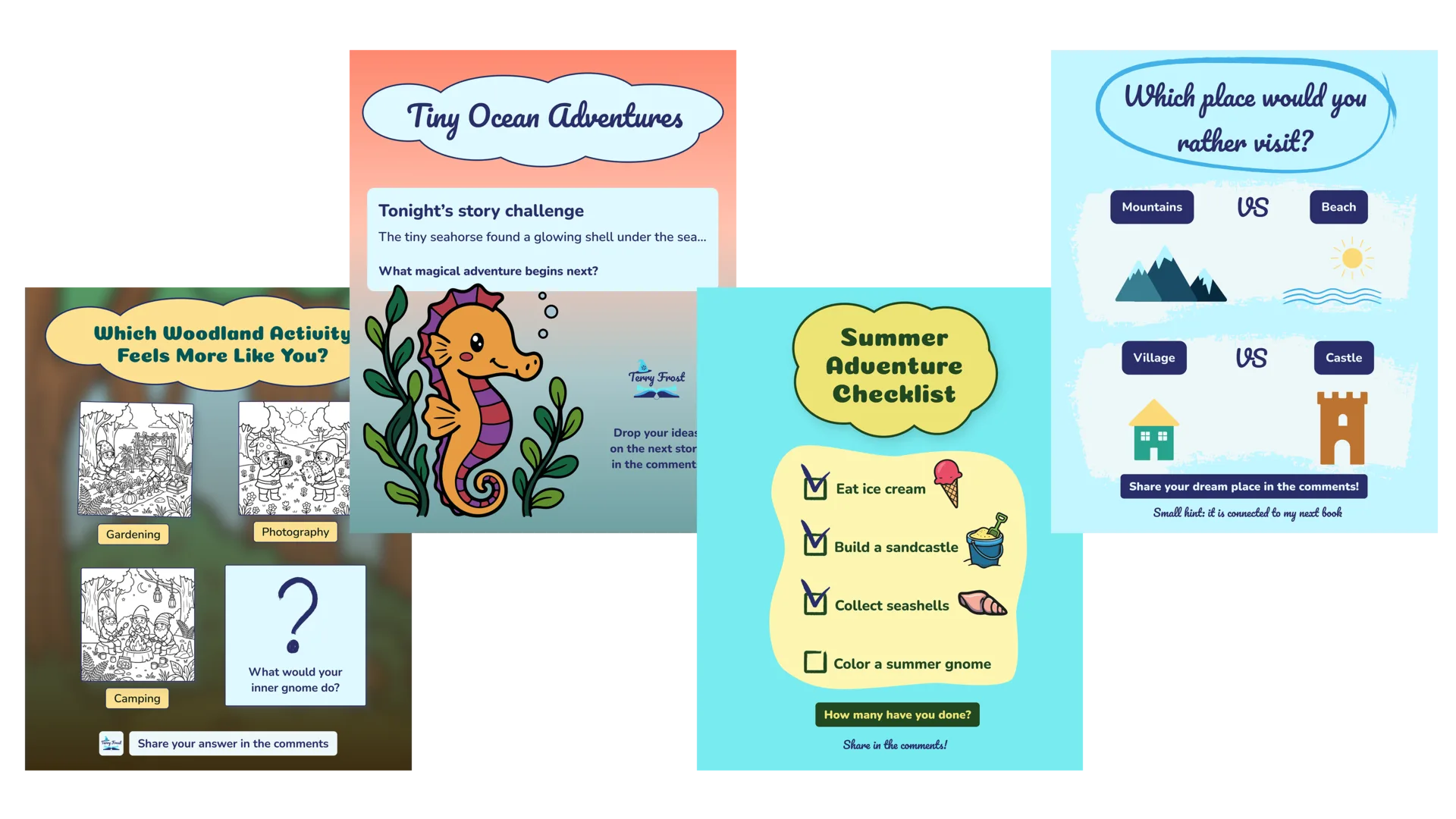
Learning From Challenges
Some posts underperformed because they were too generic or did not give the viewer a clear reason to save, click, or respond.
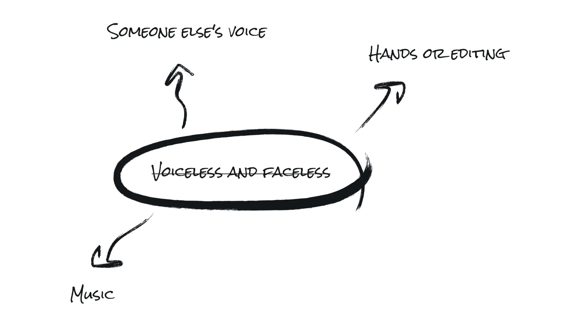
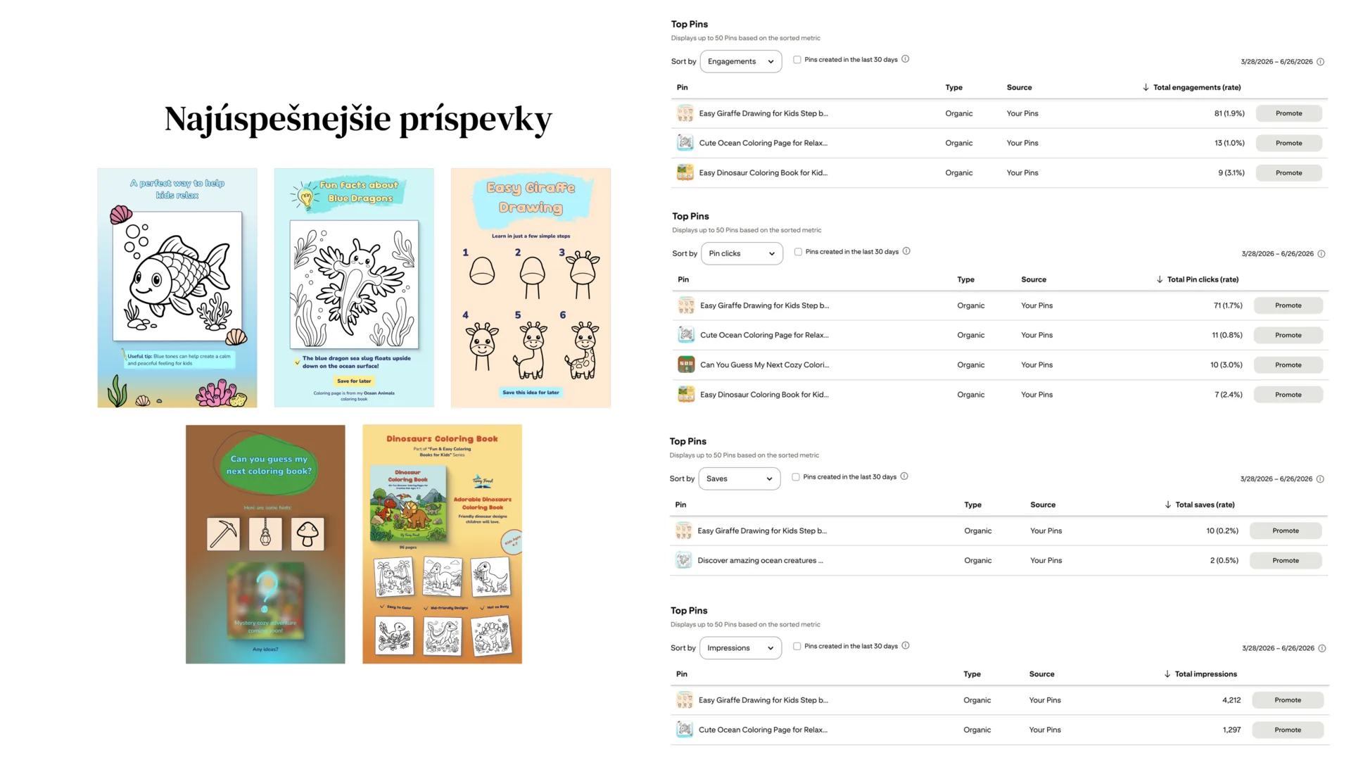
Letting Data Shape the Strategy
The strongest posts usually had a specific hook, a clear visual promise, and a reason to come back later. Data helped turn intuition into a repeatable direction.
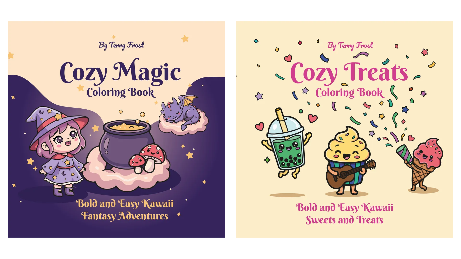
Expanding Beyond Social Media
Book covers and product visuals extended the brand beyond posts. They needed to feel like part of the same world, not separate one-off designs.
Managing Consistency in a Growing System
The project taught me how brand systems grow over time. A small author brand needs enough structure to be recognizable and enough flexibility to keep producing new stories.