Packaging
Naturiq
A packaging redesign that gives a premium nut mix a more natural, trustworthy, and valuable shelf presence.
Elevating Nature Through Packaging
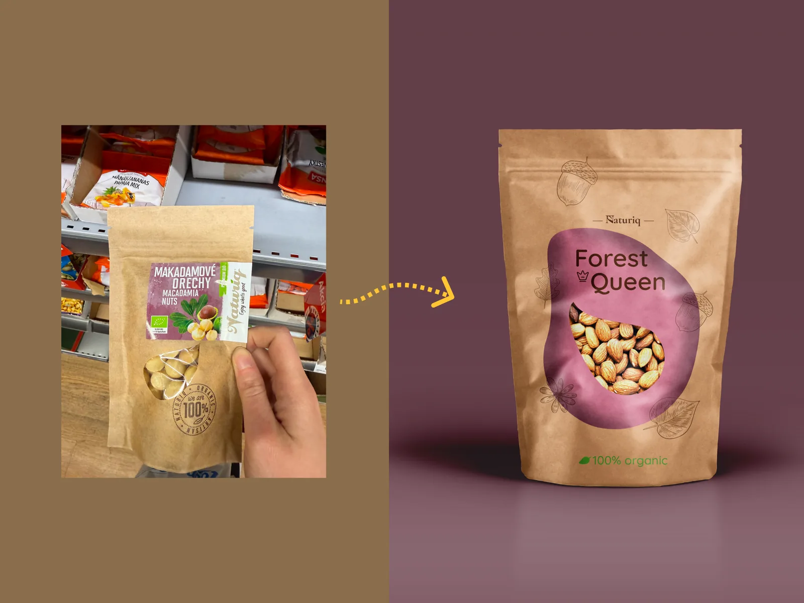
Naturiq is a packaging redesign for a premium nut mix. The project keeps the natural and sustainable character of the brand, while making the product feel more valuable on the shelf.
Time spent: 2 weeks
From Eco-Friendly to Premium
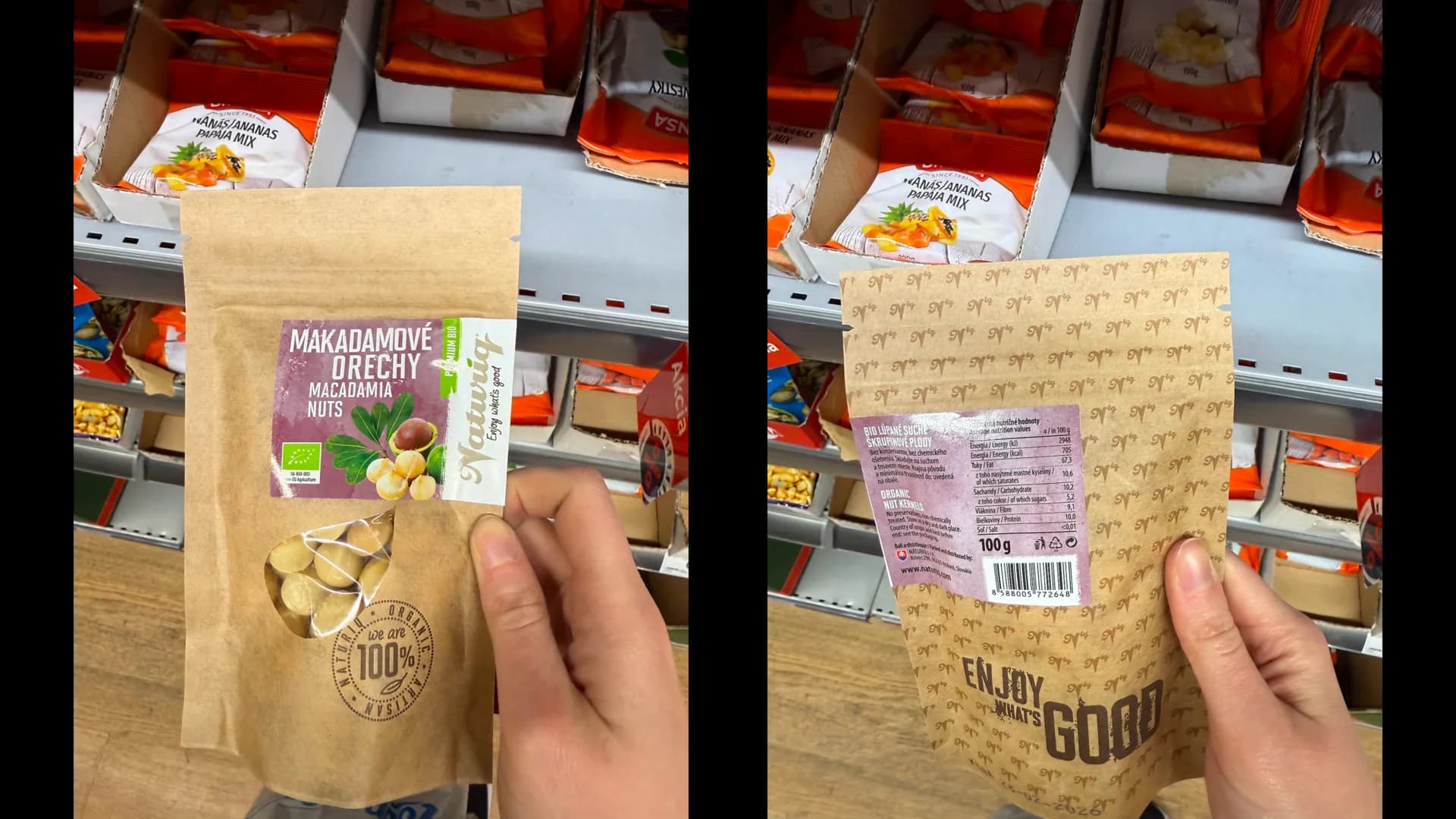
The original packaging communicated an eco-friendly direction, but it did not fully support the higher price point of the product. It felt too generic for a premium nut mix.
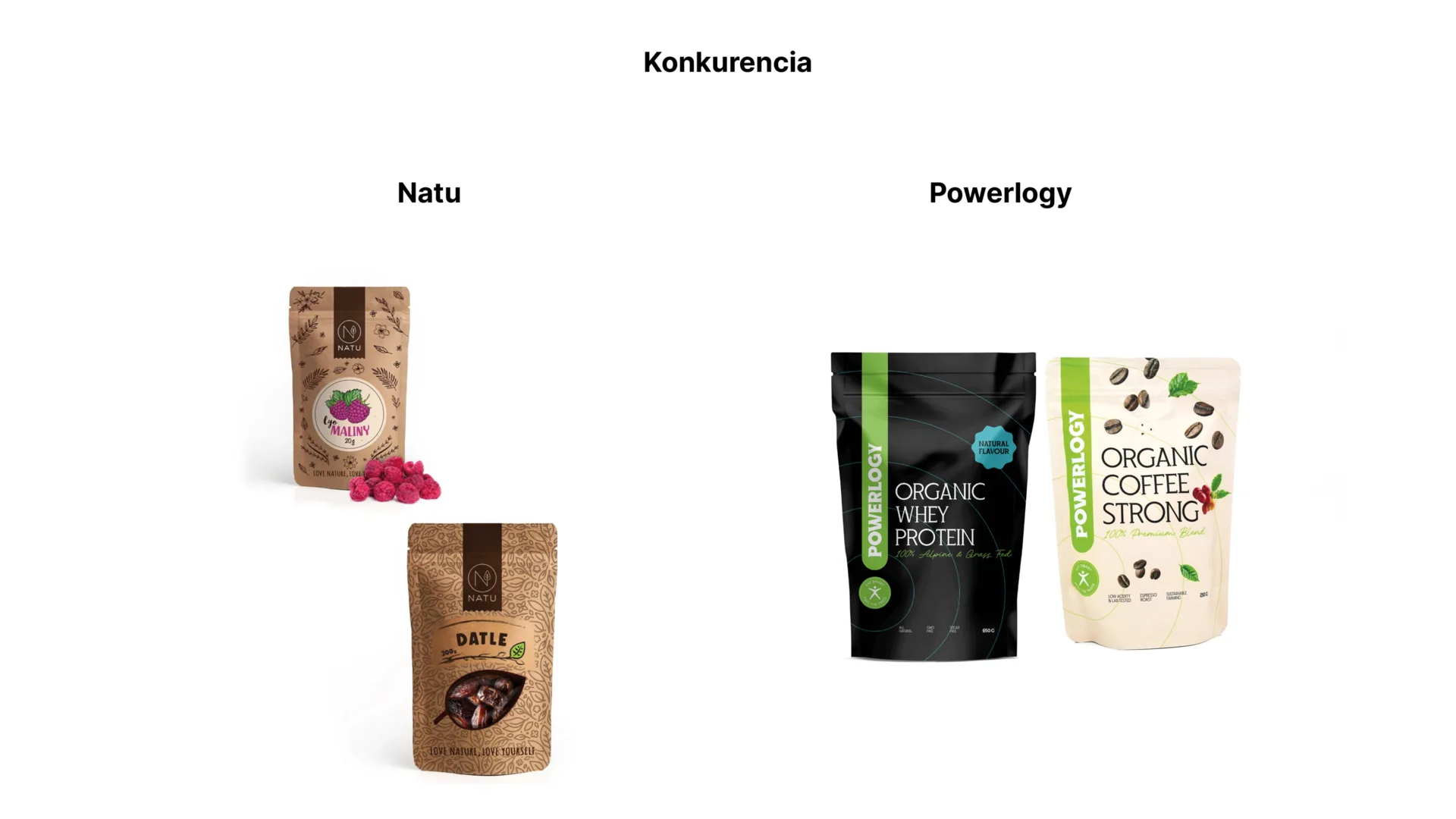
Learning from Premium Competitors
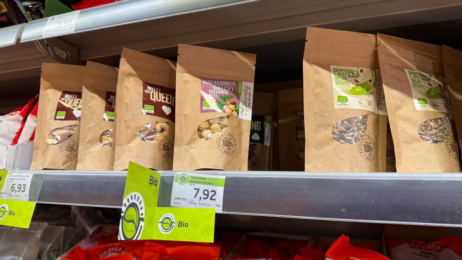
I analyzed brands in the premium healthy food category to understand how they communicate quality, sustainability, and trust through packaging.
Natural Character, Premium Perception
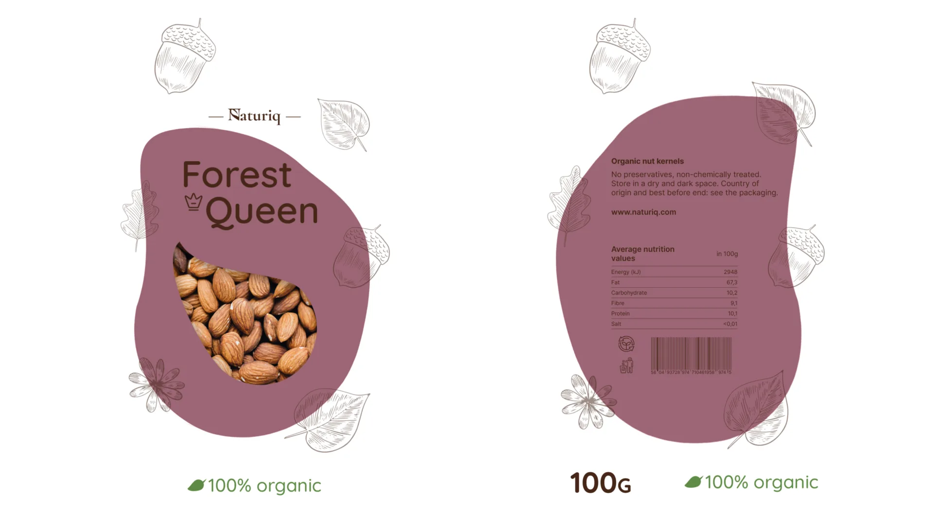
The concept balances two ideas: natural materials and a more refined shelf presence. The redesign uses restraint instead of heavy decoration.
Typography That Carries Value
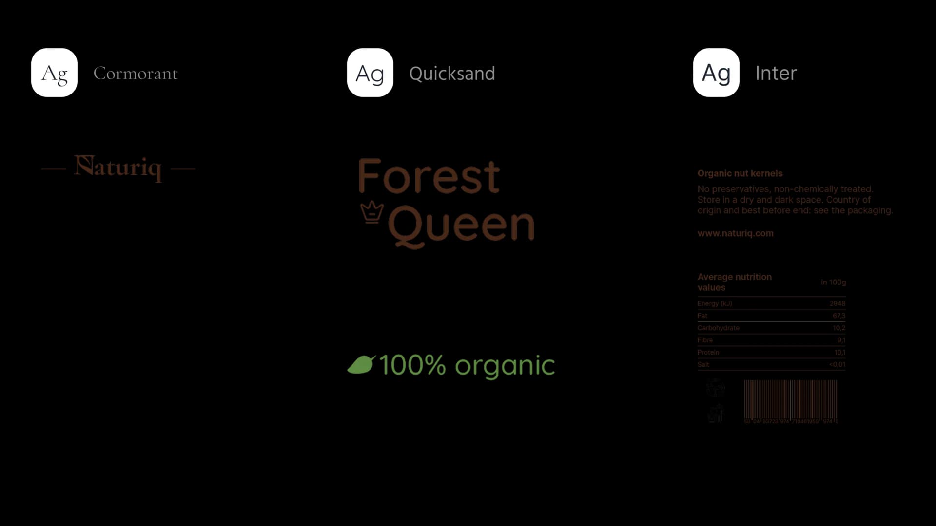
The type system combines elegant branding with soft, readable product information. Each typeface has a specific role, from logo to product name to practical details.
Details That Build Differentiation
The brand example shows how small changes in naming, logo detail, color, and layout can shift the way a product is perceived.
Changes Beyond the Package
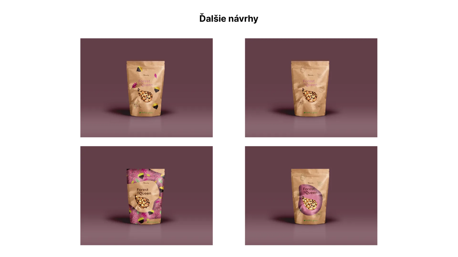
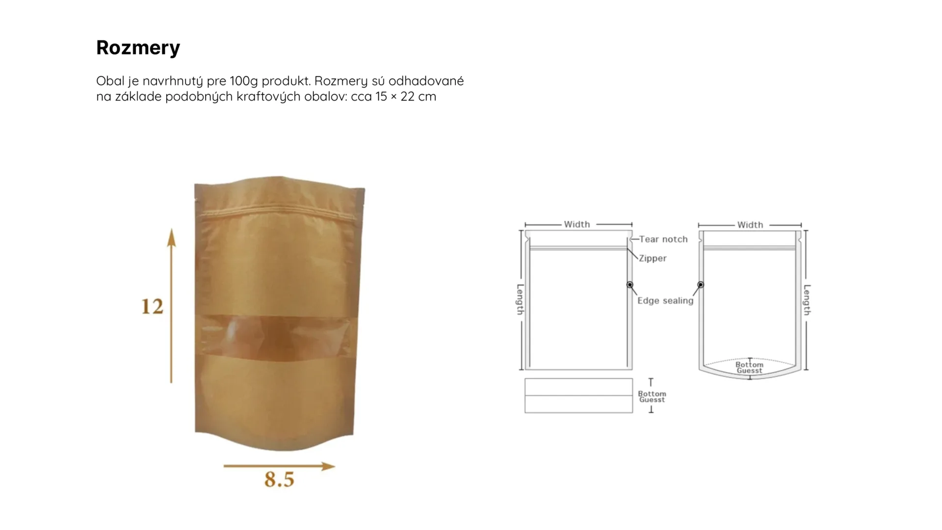
The redesign includes kraft material, a visible product window, a more elegant name, and restrained illustrations that support the premium natural direction.
Packaging as Brand Identity
The final packaging shows how a product wrapper can become a communication tool. It protects the product, but it also tells customers what kind of value the brand offers.