UX/UI
FrameOn
A cinema booking website concept shaped to feel calm, focused, and quietly futuristic.
Cinema Ticket Booking Without Unnecessary Friction
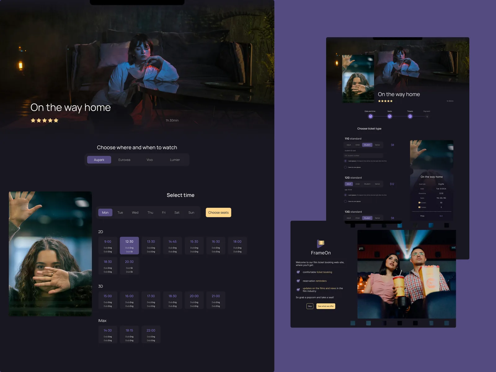
FrameOn is a conceptual cinema ticket booking website. The goal was to make choosing a film and reserving a seat feel clear, calm, and a little cinematic.
Time spent: 1 month
What Everyday Cinema Visitors Revealed
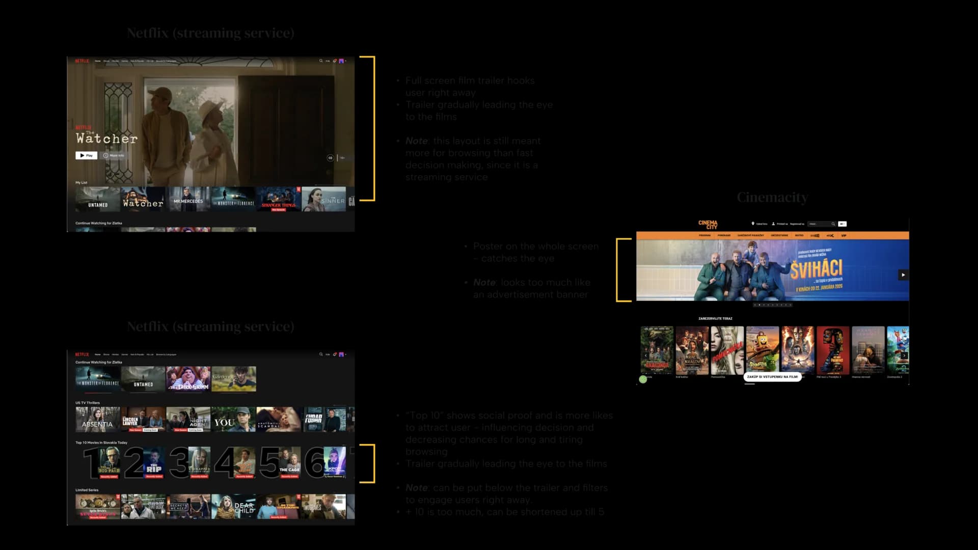
I looked at existing cinema platforms and common booking patterns. Most services solve the basic task, but the experience can feel visually crowded and split across too many decisions.
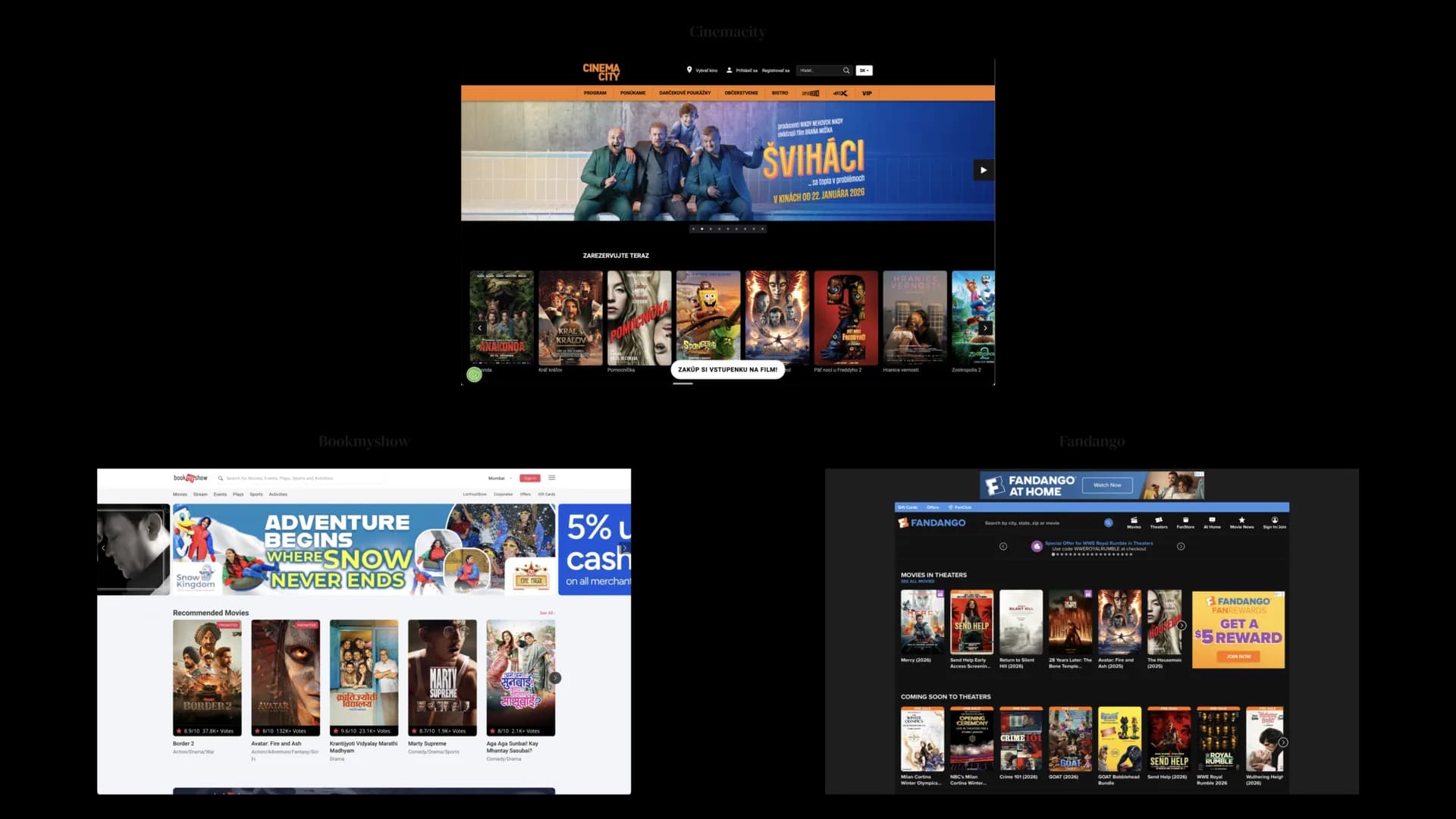
Common Problems in Existing Cinema Platforms
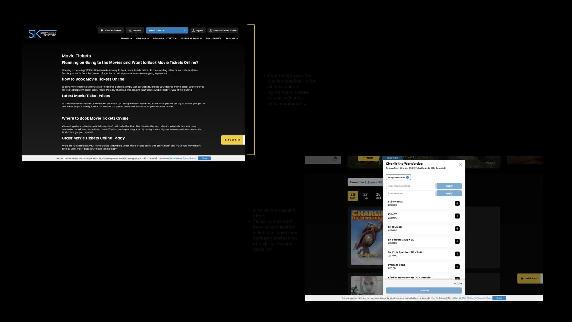
The main issues were unclear film discovery, too many steps shown at once, weak onboarding, and booking flows that made users worry about losing progress.
Designing a Cinematic Atmosphere Without Stress
The first onboarding direction was too decorative and did not explain the product clearly enough. I revised it so the tone still felt cinematic, but the purpose of each step became easier to understand.
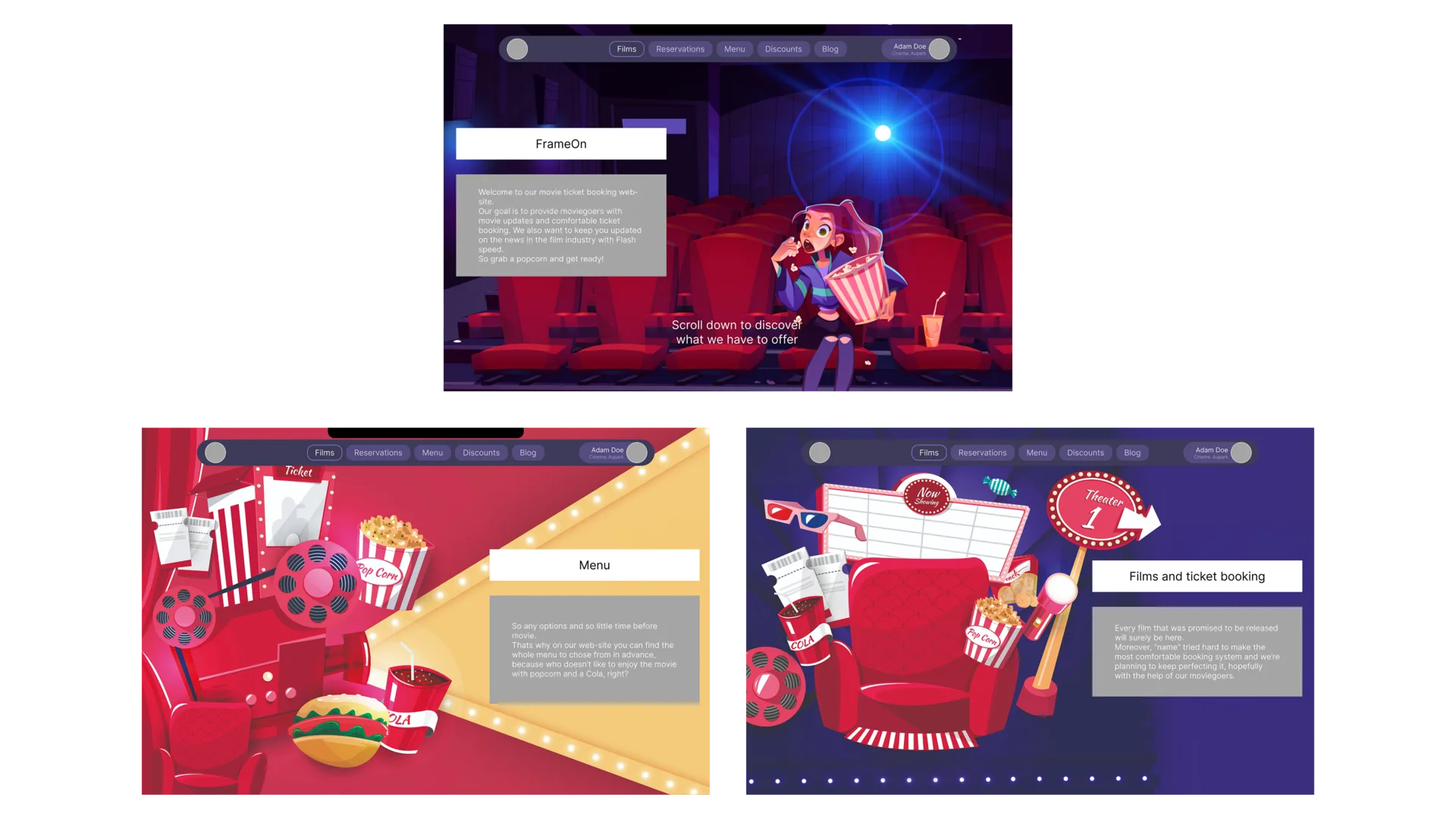
A Clearer First Impression
The final onboarding introduces the platform through simple benefits and a calmer rhythm. It sets the visual mood without delaying the user from starting.
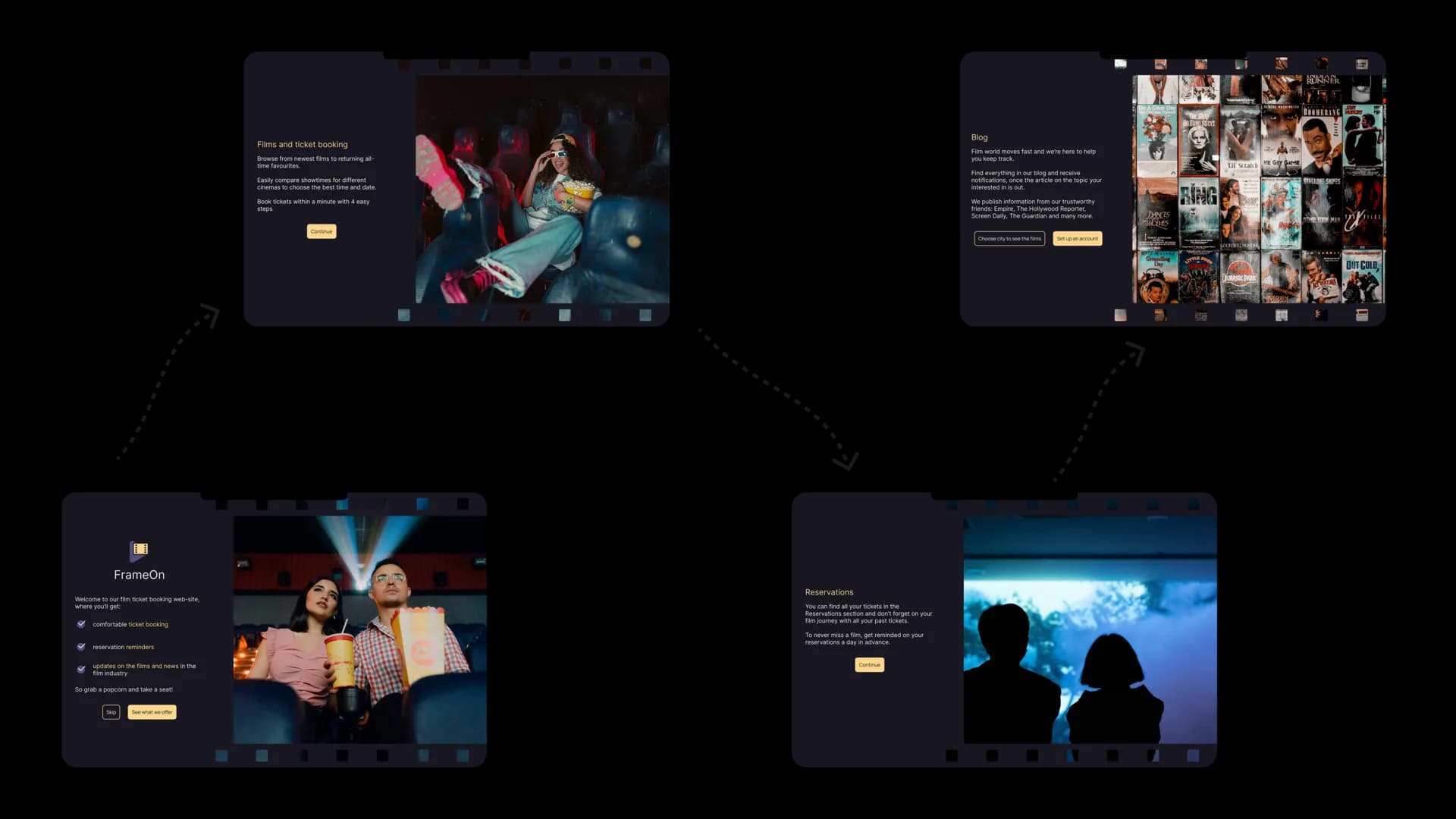
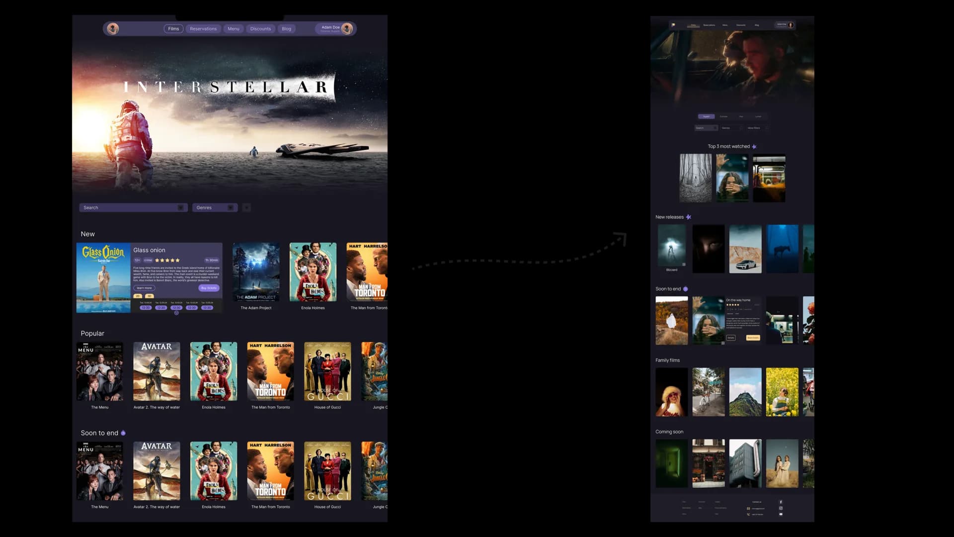
Film Discovery With Focus
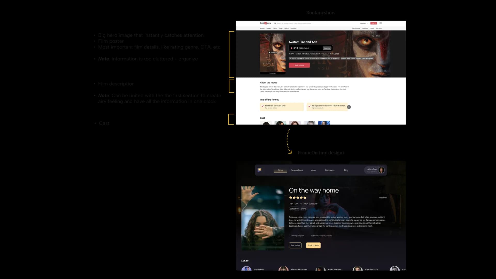
The films page keeps browsing direct. It gives users enough information to compare options without turning the screen into a wall of posters.
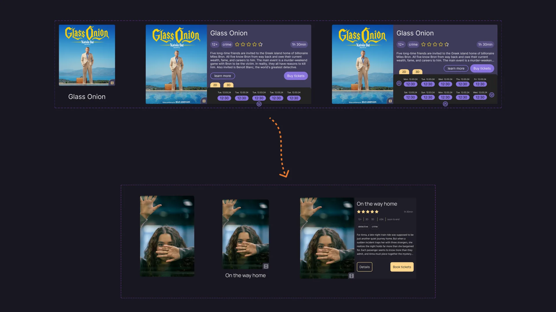
Cards That Help Decisions
Film cards use hierarchy, spacing, and quick metadata to support scanning. The goal was to make each option easy to evaluate before opening the detail page.
Building the Booking Flow
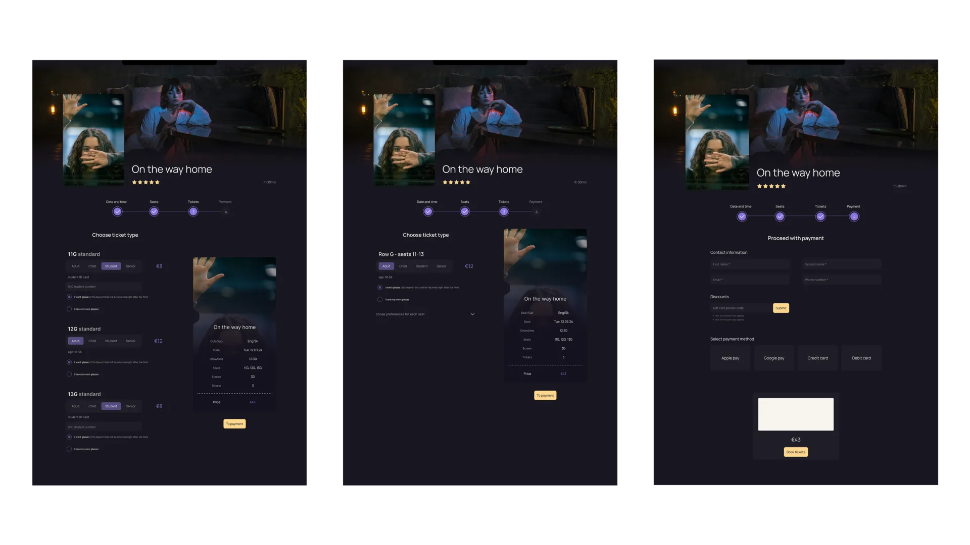
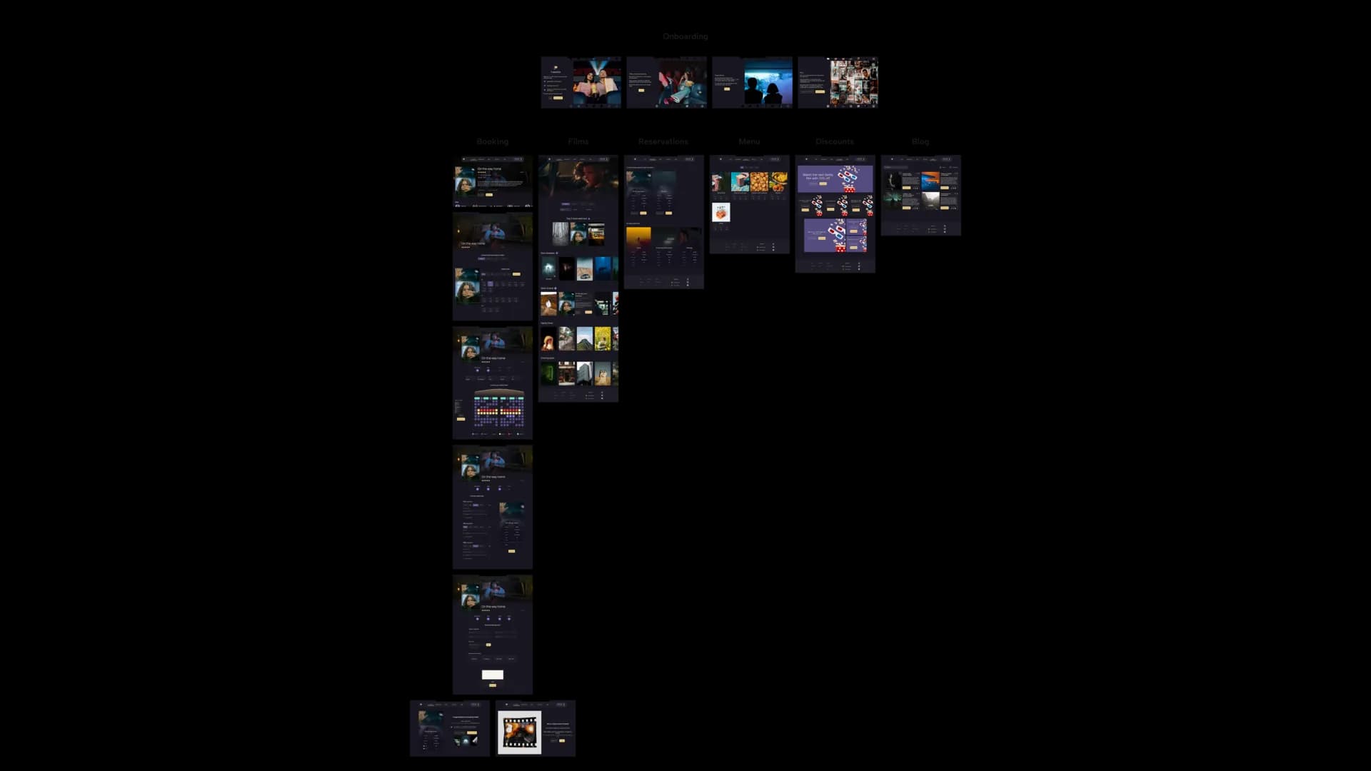
The booking process is split into steps, so seat choice, time, ticket type, and payment each get enough attention. Users always know where they are in the flow.
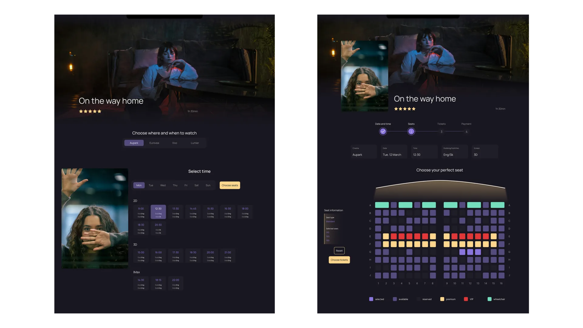
Reducing Cognitive Load
Instead of showing every decision at once, details open when needed. This keeps the interface focused and makes the reservation feel less risky.
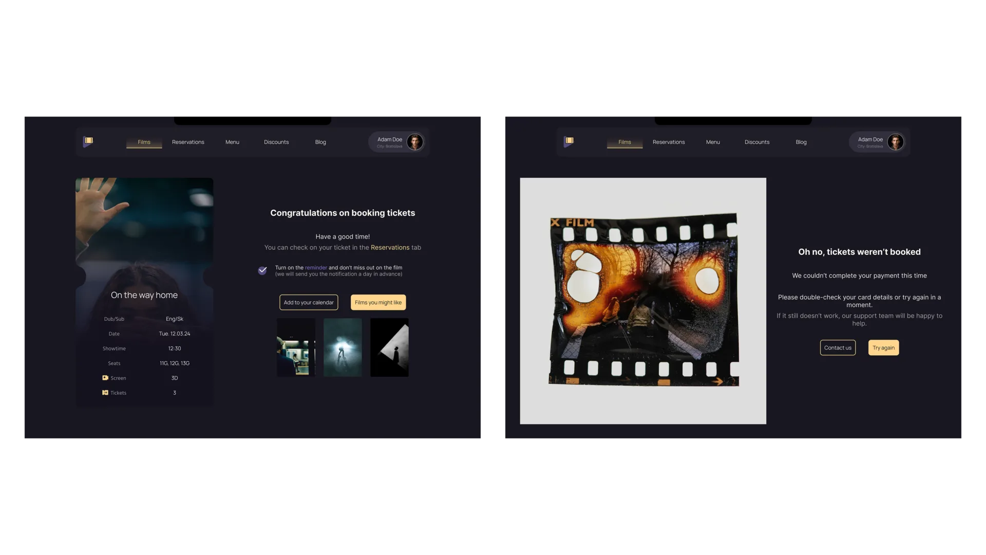
After the Booking
Success and failure states were designed as part of the journey, not as afterthoughts. They explain what happened and what the user can do next.
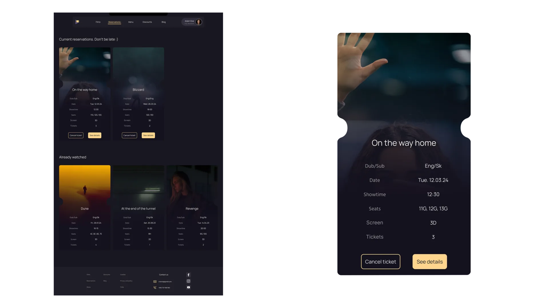
Reservations in One Place
The reservations area keeps upcoming bookings accessible, so users can return to tickets and details without searching through email.
A Complete Booking Experience
The user flow connects onboarding, browsing, details, booking, payment, and reservation management into one coherent path.
A Smoother System
The final solution reduces friction by making the booking path more predictable and visually calmer.
What These Changes Could Bring
FrameOn taught me how much a service experience depends on pacing. A good flow does not only look clear; it gives users the right decision at the right time.