Editorial
Design Trends Through Disciplines
An editorial project that turns visual trend research into a clear, tactile reading experience.
Where Design Trends Meet
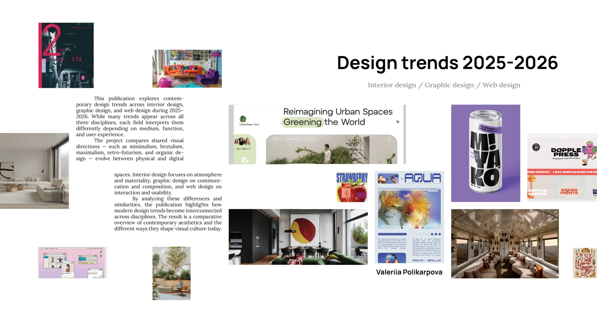
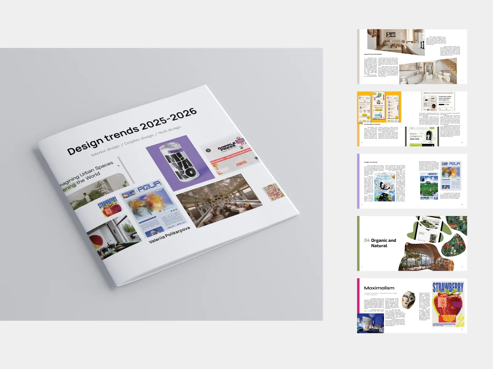
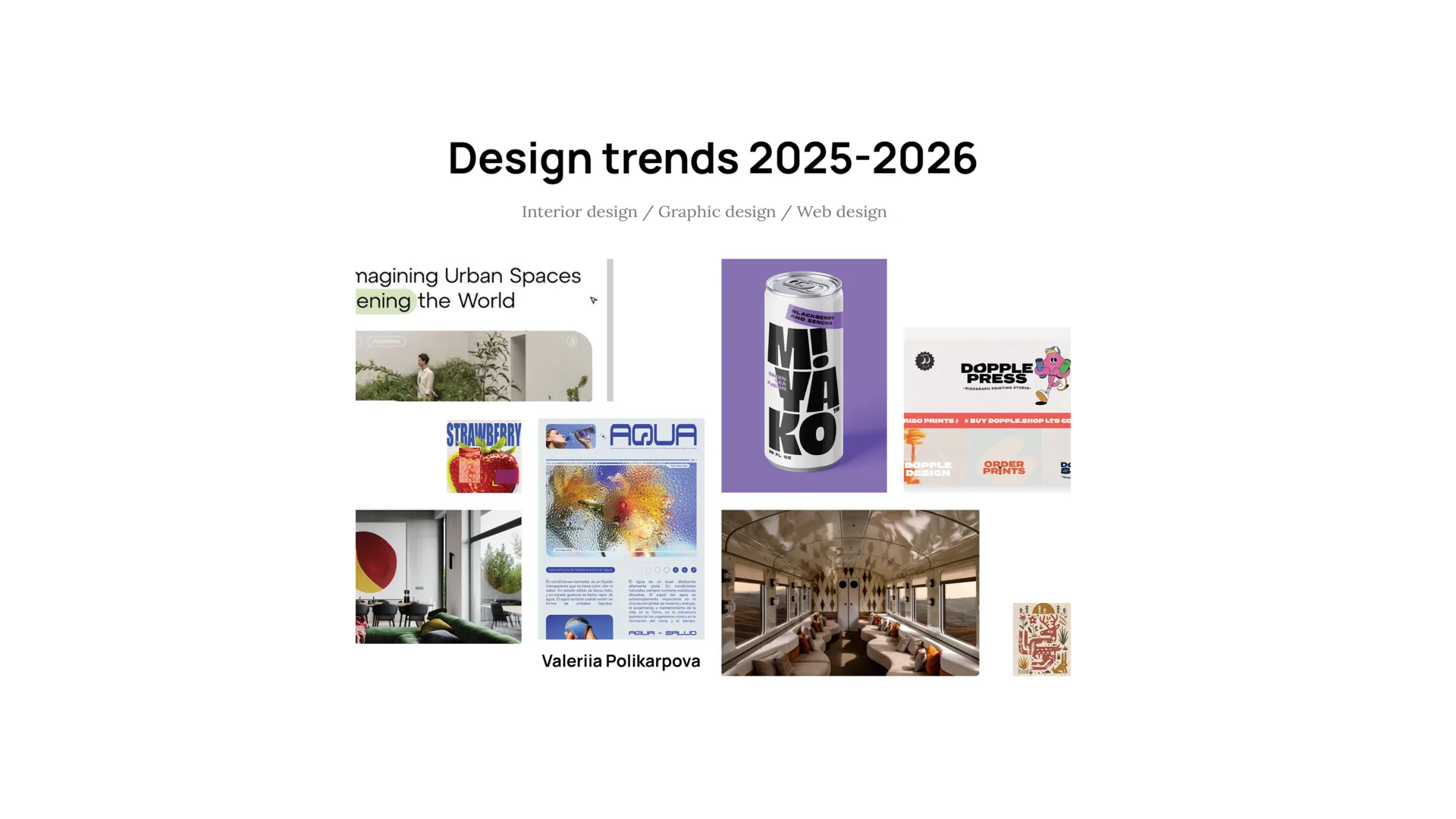
This publication explores five visual trends across interior design, graphic design, and web design. The goal was to turn research into a printed guide that feels useful, structured, and enjoyable to read.
Time spent: 3 weeks
Audience: design students, beginning designers, and creative people who want to understand current visual culture more clearly.
Finding Connections Across Disciplines
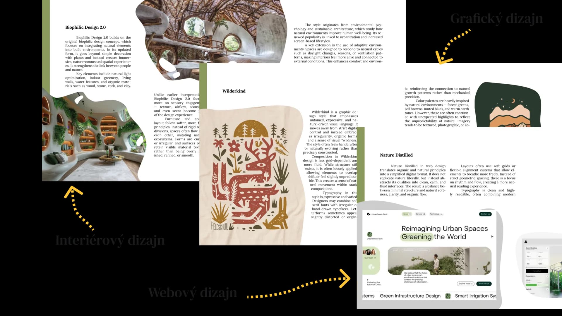
Design trends are often presented inside separate fields. Organic interiors, organic posters, and organic websites may look different, but they often share the same principles.
The challenge was to show those connections without flattening the differences between disciplines.
Gathering the Research
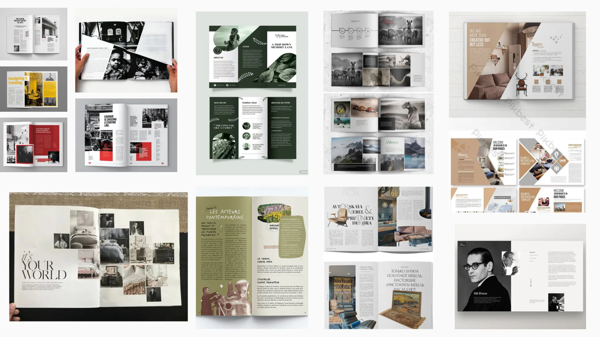
I collected examples of each trend across different creative fields, then sorted them by visual characteristics, structure, color, and use case.
The publication needed to do more than show references. It had to explain why the examples belong together.
Building a Visual Direction
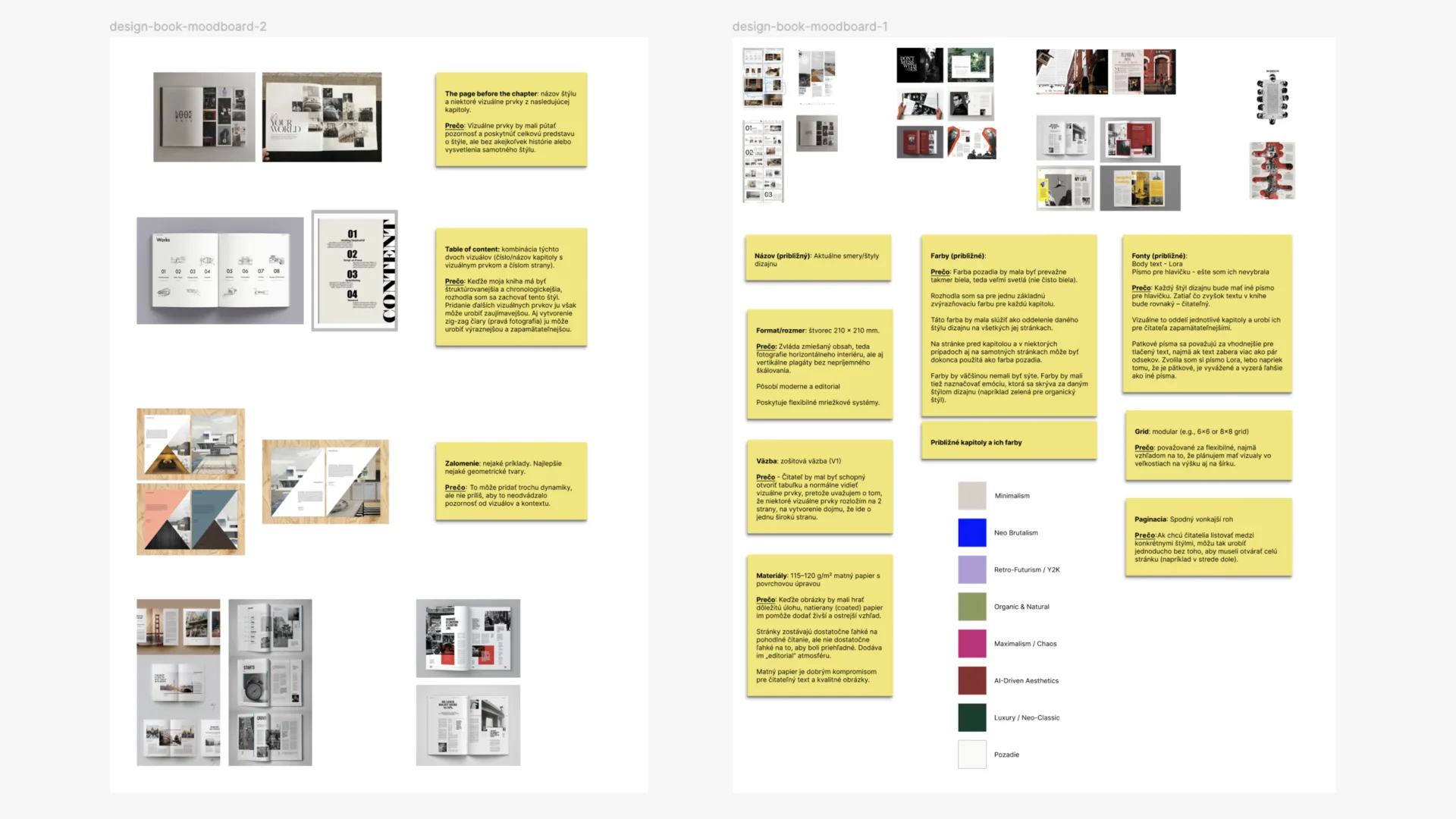
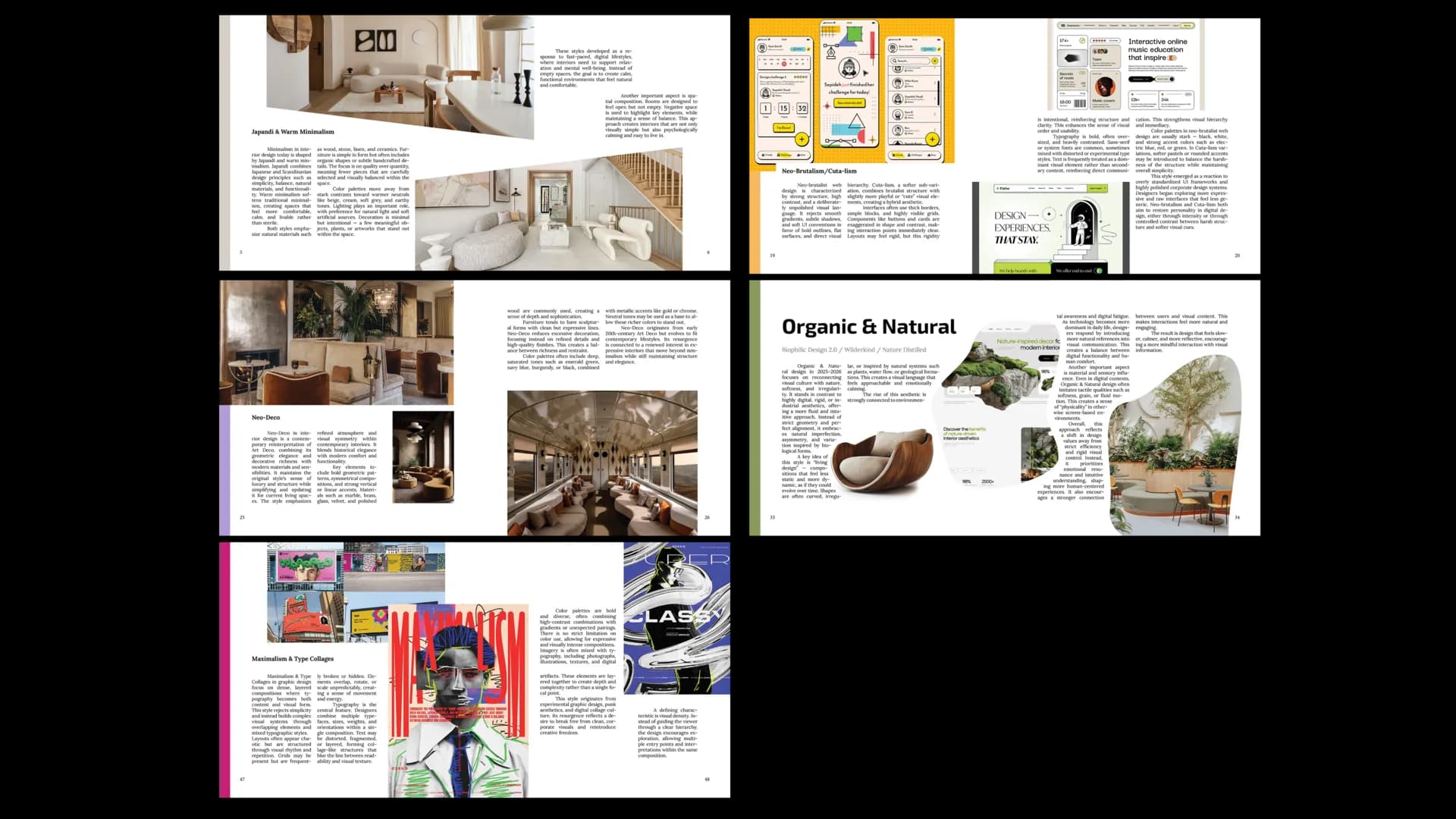
Moodboards helped define the tone of each trend and gave every chapter a distinct visual personality while keeping the book consistent as one system.
Making It Feel Editorial
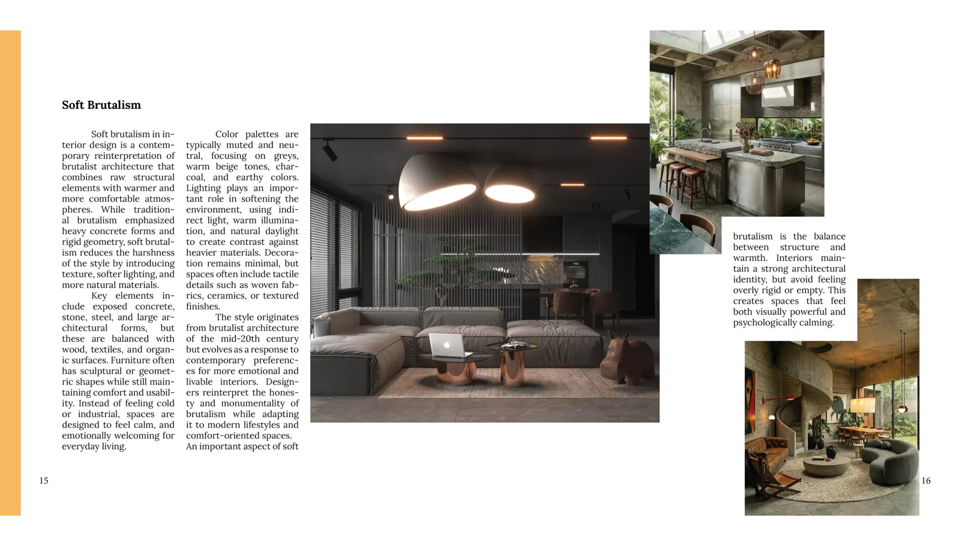
The book uses a square format of 210 x 210 mm. This format works well for both vertical and horizontal examples and gives the layout enough flexibility for comparisons.
Production Choices With Purpose
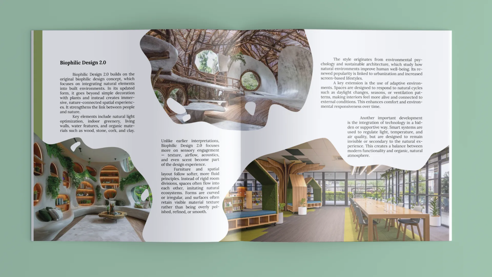
The V1 binding was chosen because it supports spreads and lets visual examples breathe across the page. The paper choice balances image quality with comfortable reading.
Material and Reading Experience
Because images carry much of the explanation, the material had to reproduce them clearly without making the book feel too heavy or glossy.
Clarity as a Learning Tool
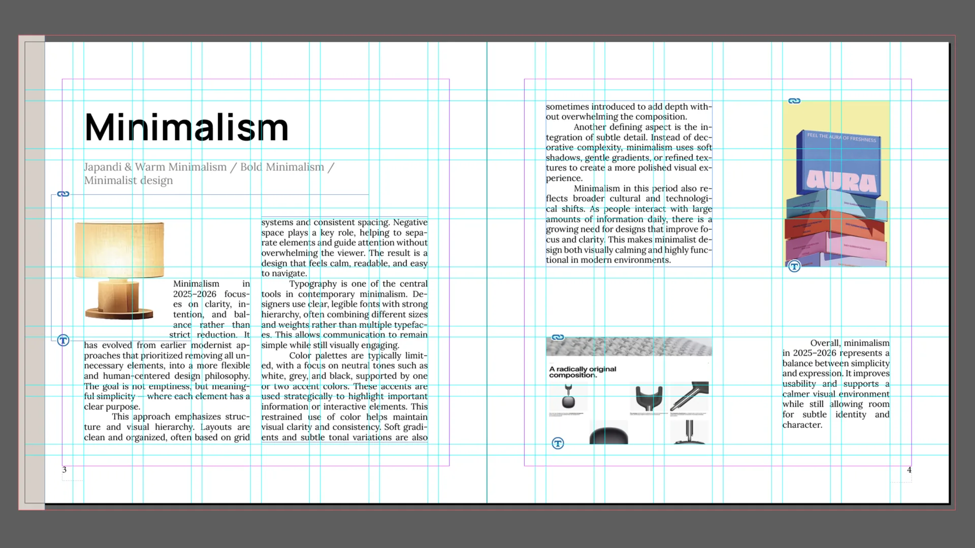
A consistent grid creates order across the publication. Clear hierarchy, chapter markers, and repeated structures help readers compare ideas quickly.
Every Detail Has a Function
The layout balances written explanations with visual references so the images support understanding rather than acting as decoration.
Color as Navigation
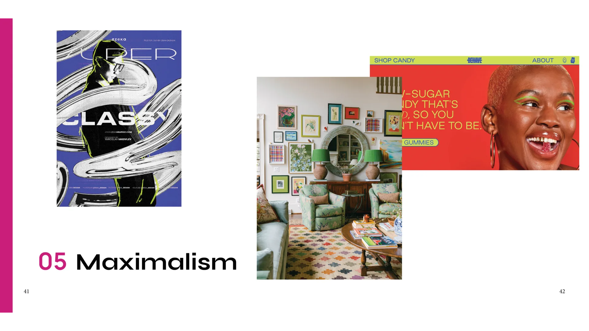
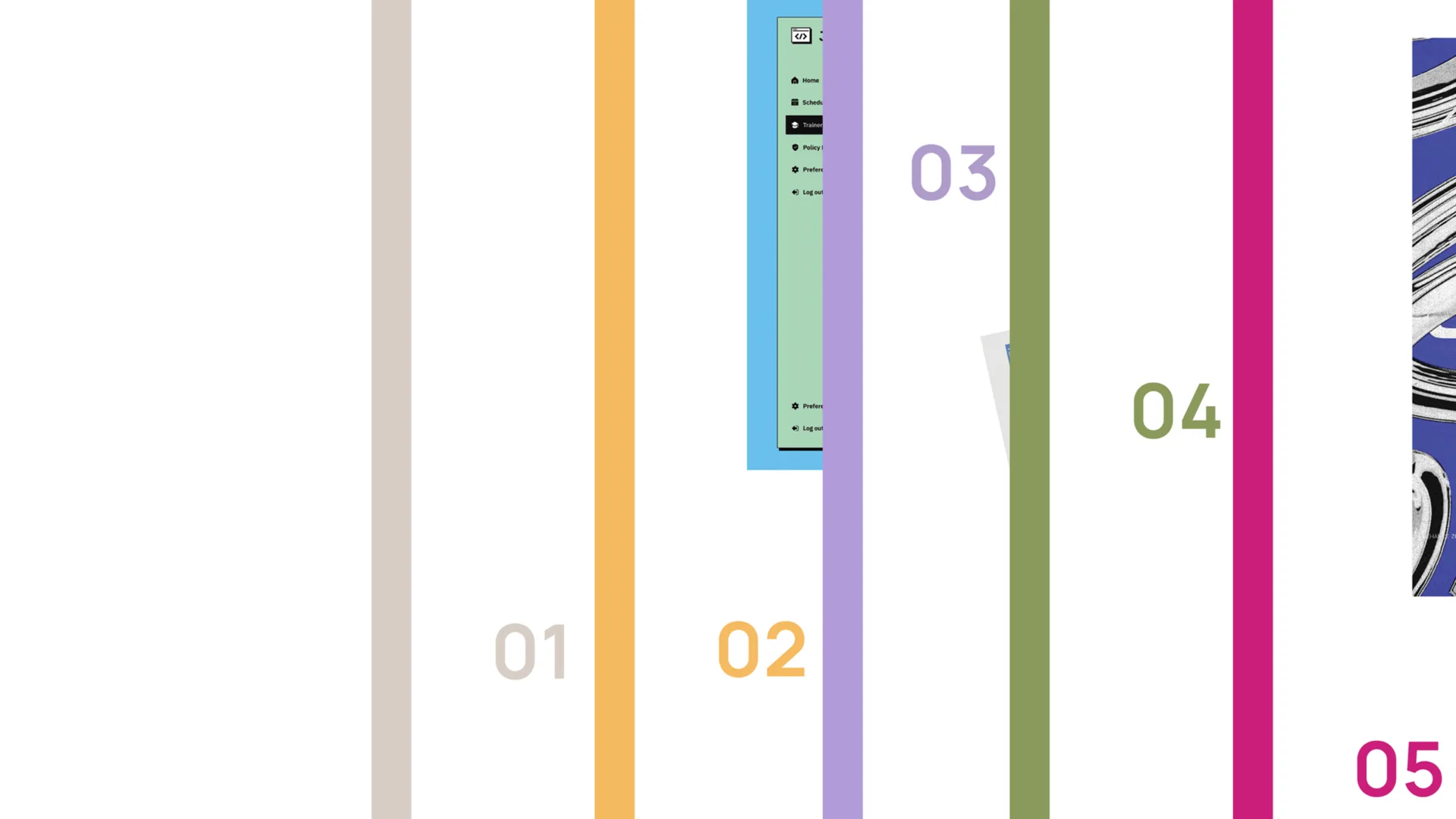
Each trend receives its own color. The palette helps readers recognize chapters and move through the book without relying only on page numbers.
Typography With Character
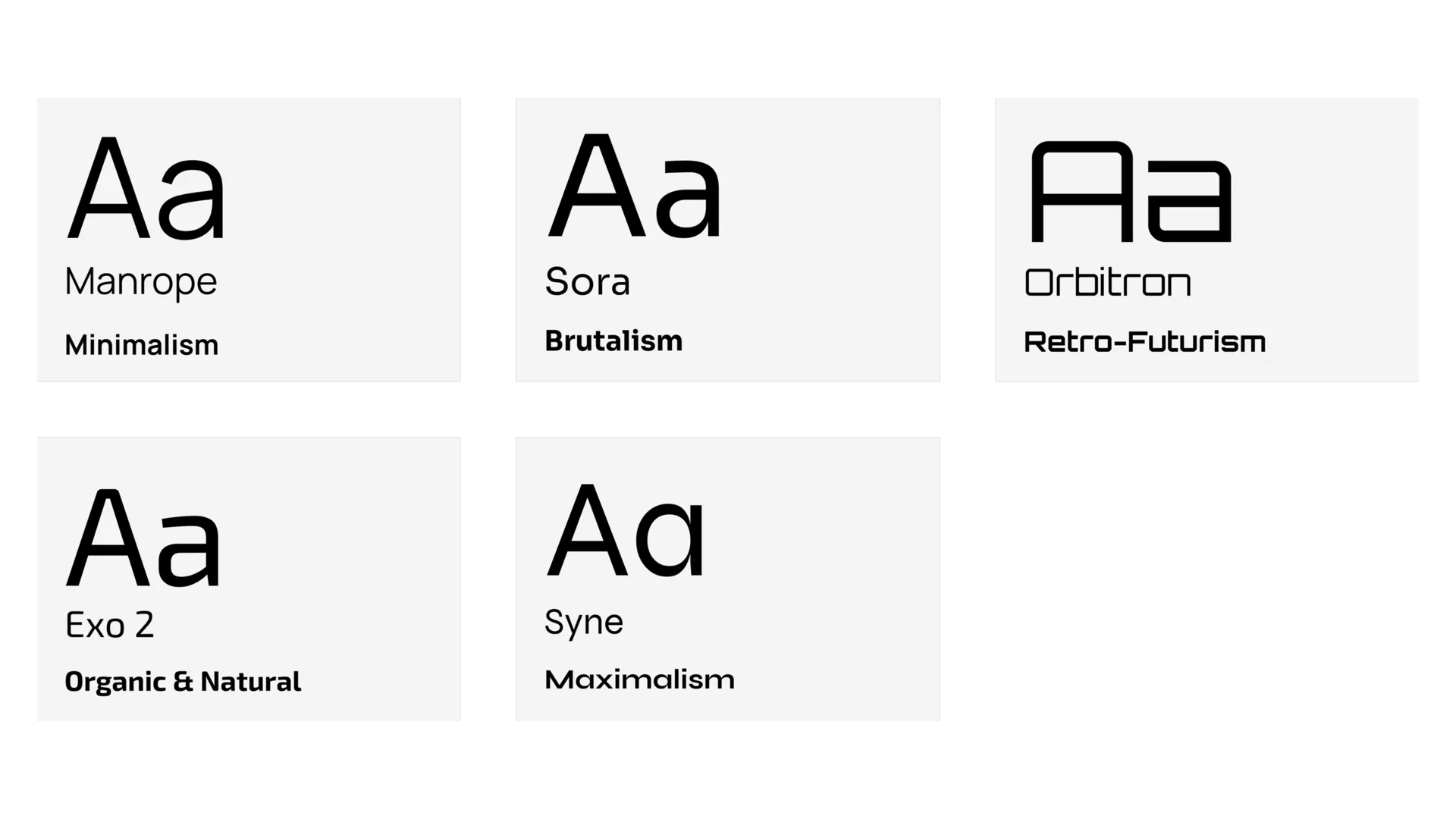
The typography system combines readable text type with more expressive chapter headings. Each trend gets a voice, but the publication still feels like one object.
Research With Style
The final pages combine education and visual exploration. The book is structured enough to be useful, but expressive enough to invite browsing.
Lessons in Information Architecture
This project taught me how much editorial design depends on organizing information before styling it. A strong system makes complex research easier to enter, compare, and remember.