UX/UI
Elevia
A thoughtful learning platform concept that makes school communication feel clear, friendly, and easy to follow.
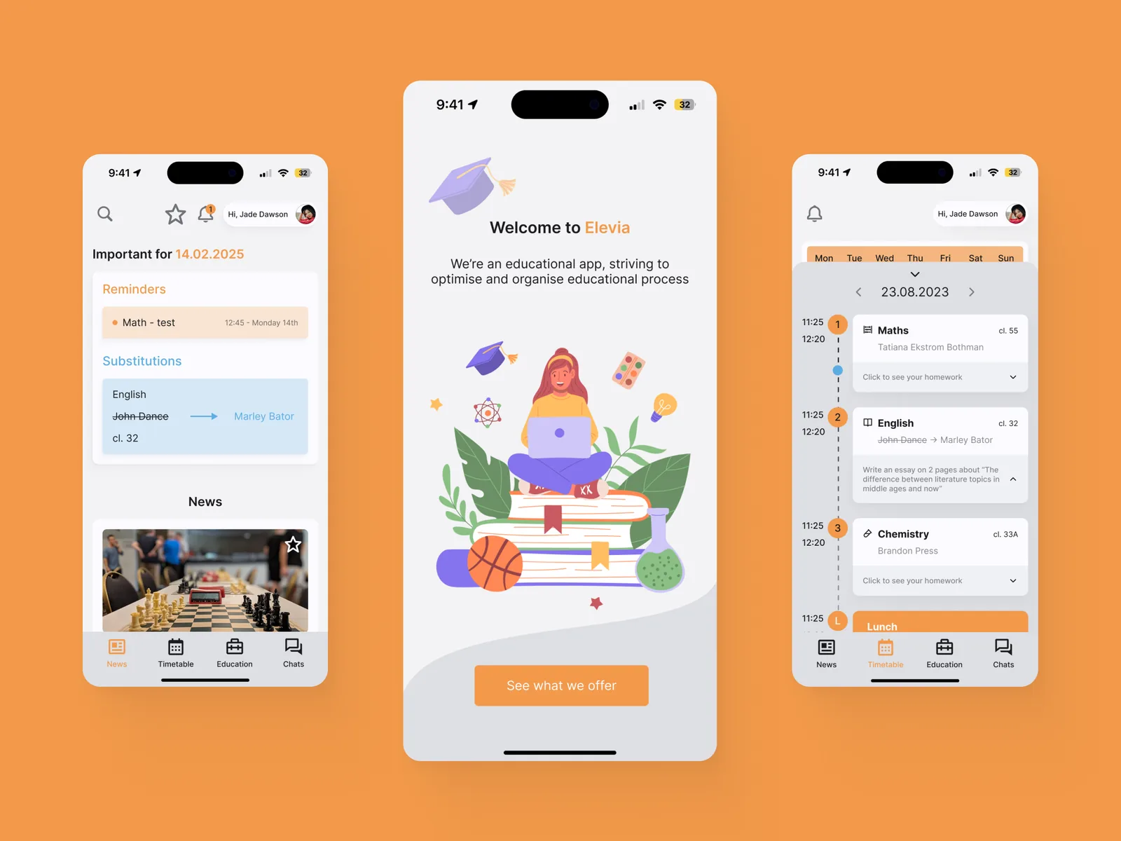
Raise Your Knowledge Higher and Stay Motivated
Elevia is a concept for a school app designed for students aged 10 to 19. It grew out of a familiar frustration: school systems often hold useful information, but they make students work too hard to find it.
Time spent: about 1 month
Goal: design a clear, motivating interface that helps students follow school updates, homework, grades, and progress without feeling lost.
Student Needs and What Keeps Them Motivated
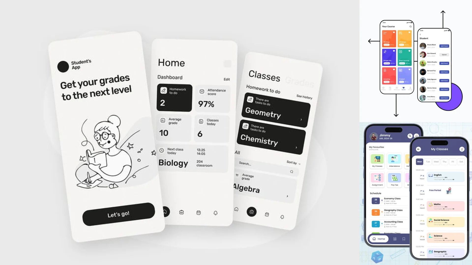
I started with informal conversations with classmates and looked at online discussions where students described their experience with school apps. The same needs kept appearing: clearer navigation, easier access to everyday information, and more motivation to follow personal progress.
The project did not try to add more noise to school life. It tried to make the necessary things easier to reach.
When Formality Overpowers Motivation
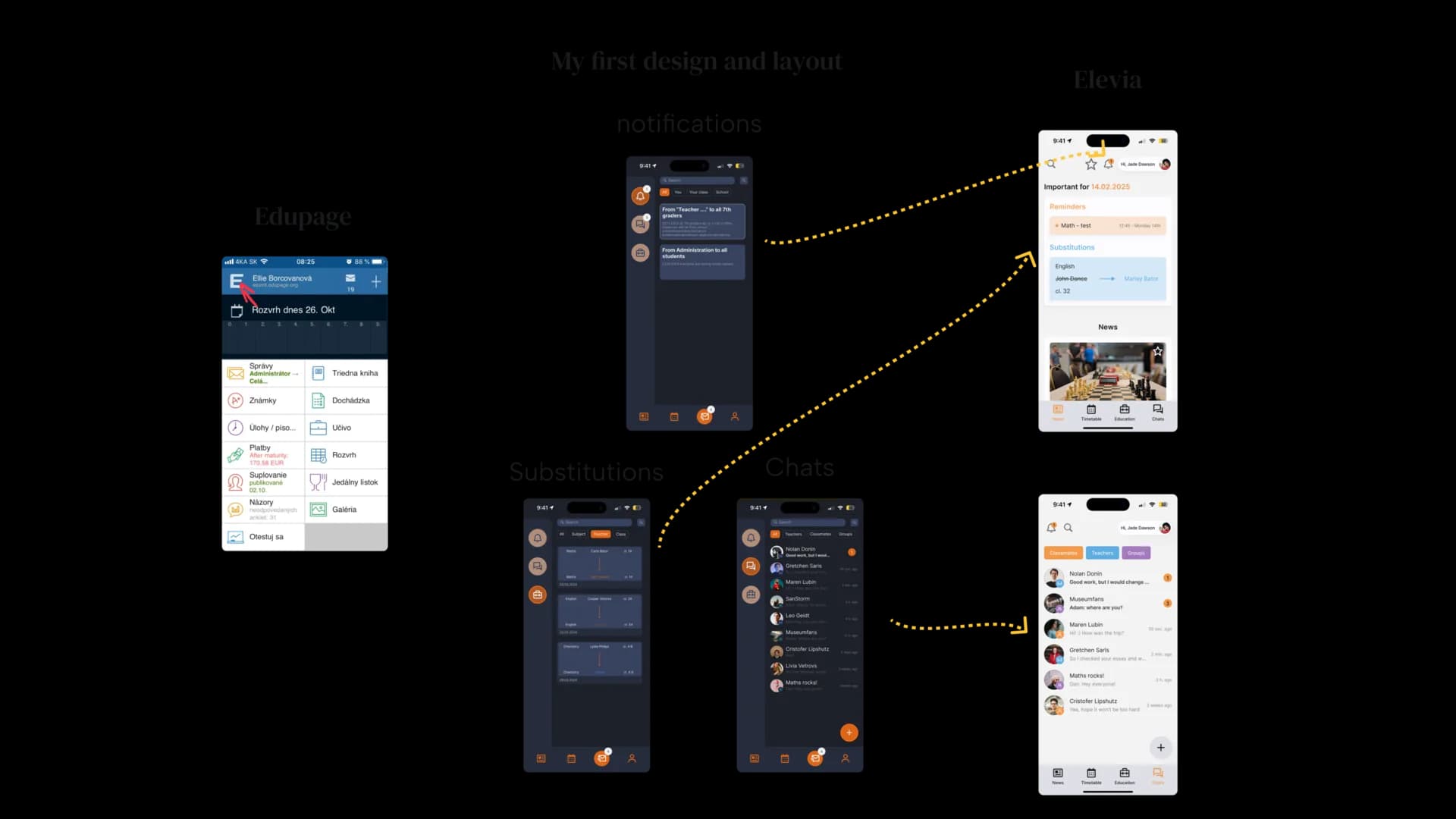
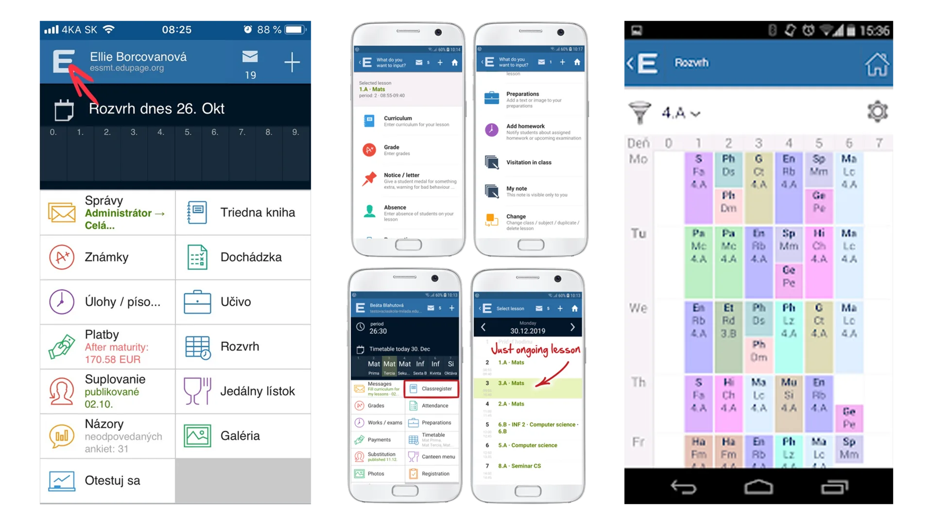
Existing school tools often feel formal, but not especially helpful. Important categories look similar, navigation is inconsistent, and the visual language rarely speaks to younger users.
That tension became the core problem: how can a school app stay organized and trustworthy while still feeling encouraging?
Energy, Trust, and Creativity
The visual system uses neutral surfaces with three accent colors. Orange carries energy and progress, blue supports trust and reliability, and purple adds a more creative tone.
Icons use sharper geometric shapes to balance the softer rounded interface. The result is friendly, but still structured enough for school information.
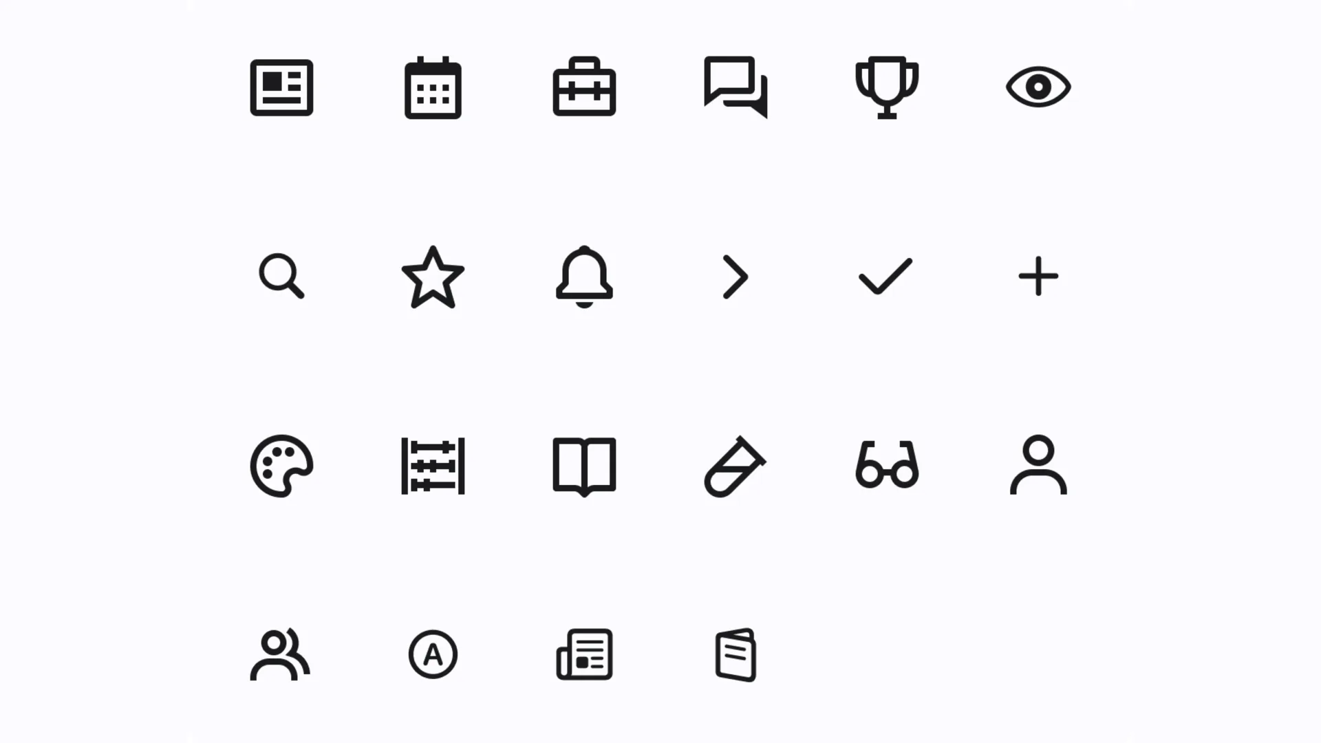
Gamification Without Pressure
Motivational elements are built around progress, achievements, and small visual rewards. They are meant to help students notice improvement, not turn school into a game that demands constant attention.
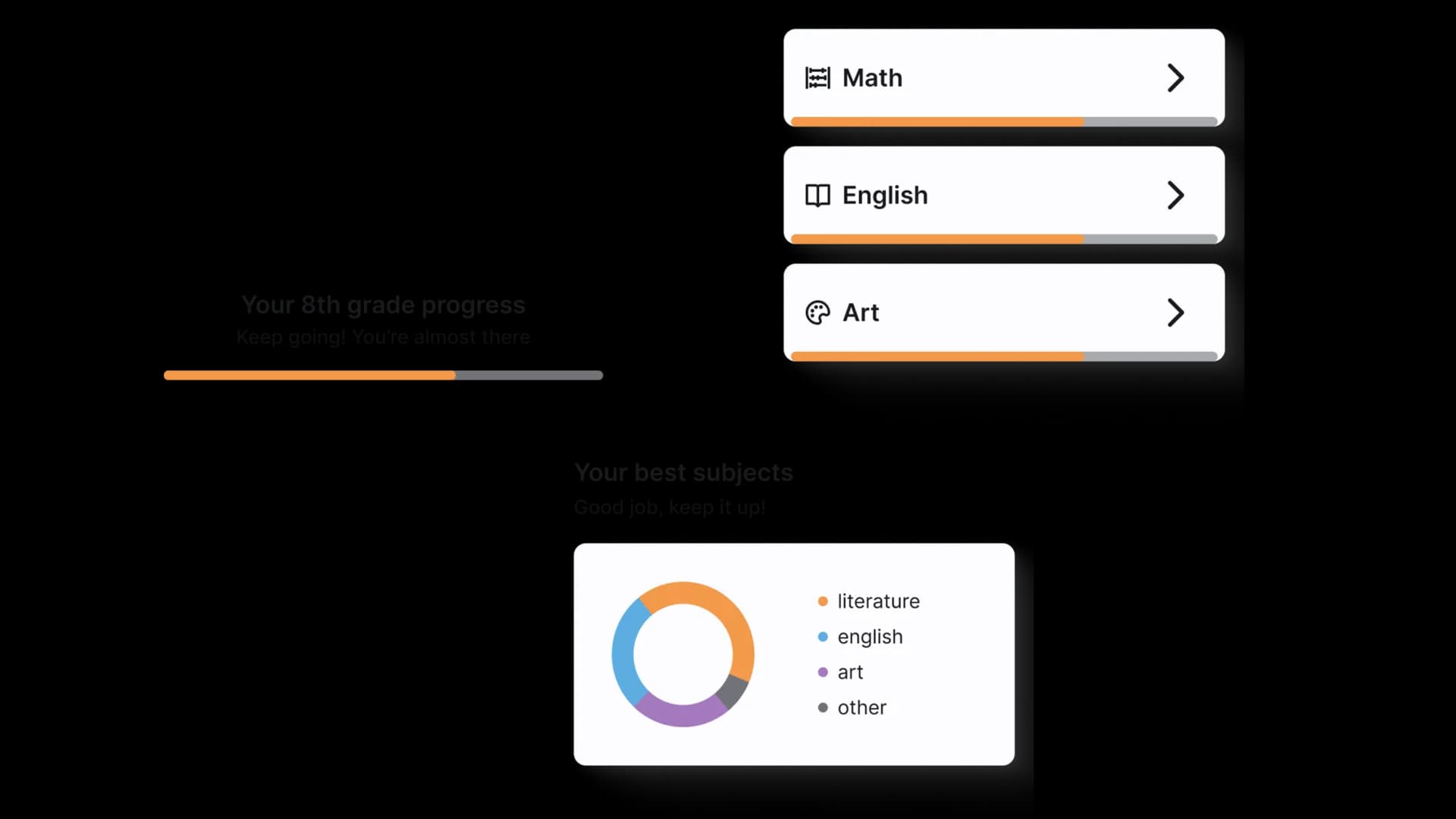
Building a Unified System
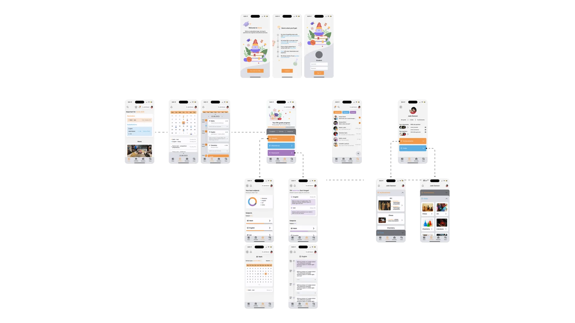
The app is organized around four main navigation areas and a separate profile section. Each part has a clear role, so students can move from updates to schedules, learning, chats, and profile details without relearning the interface.
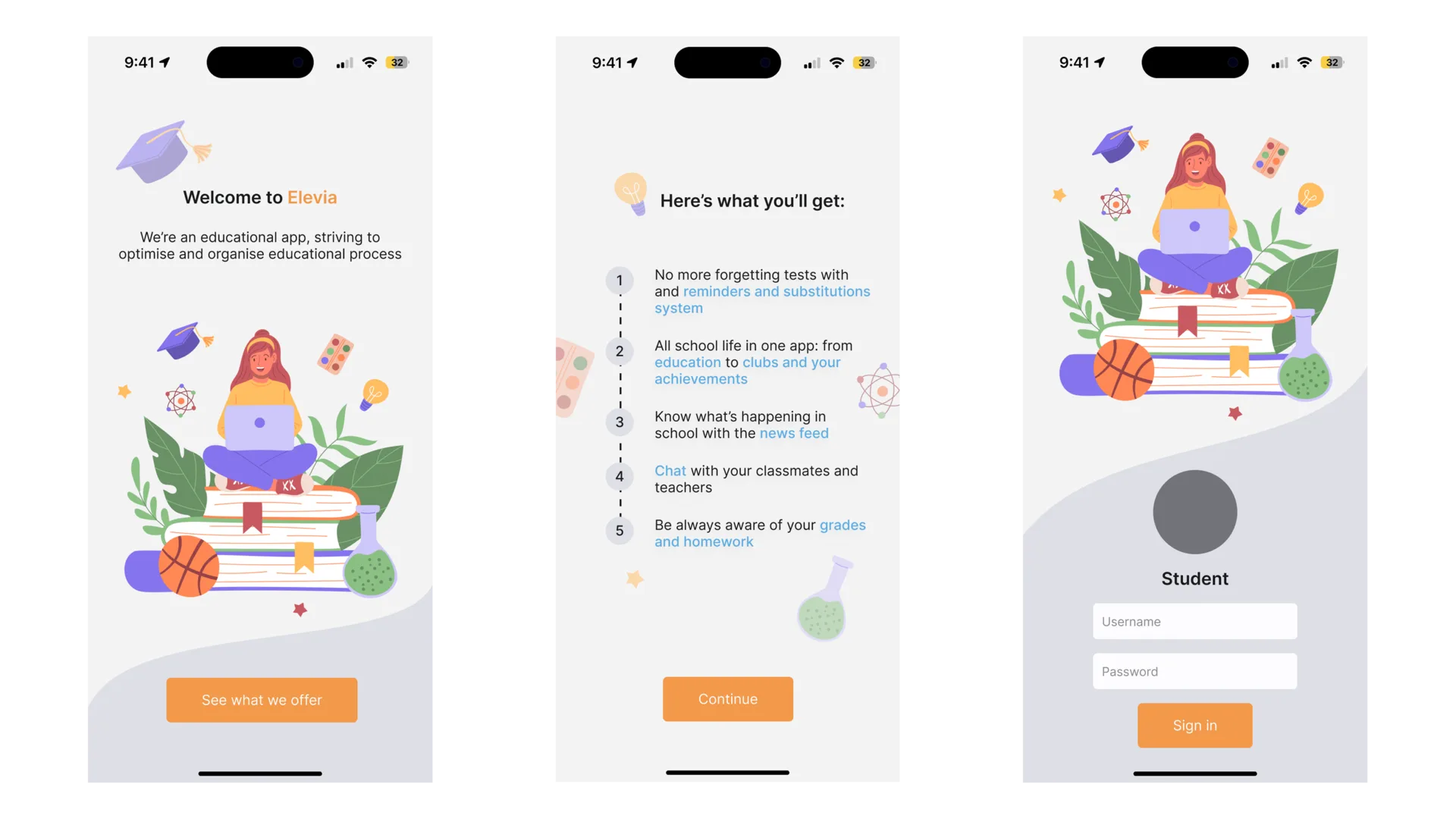
Everyday Information First
The news and substitutions area works as the daily entry point. It brings tests, substitution updates, and important school notices forward, using clear visual markers so students can scan quickly.
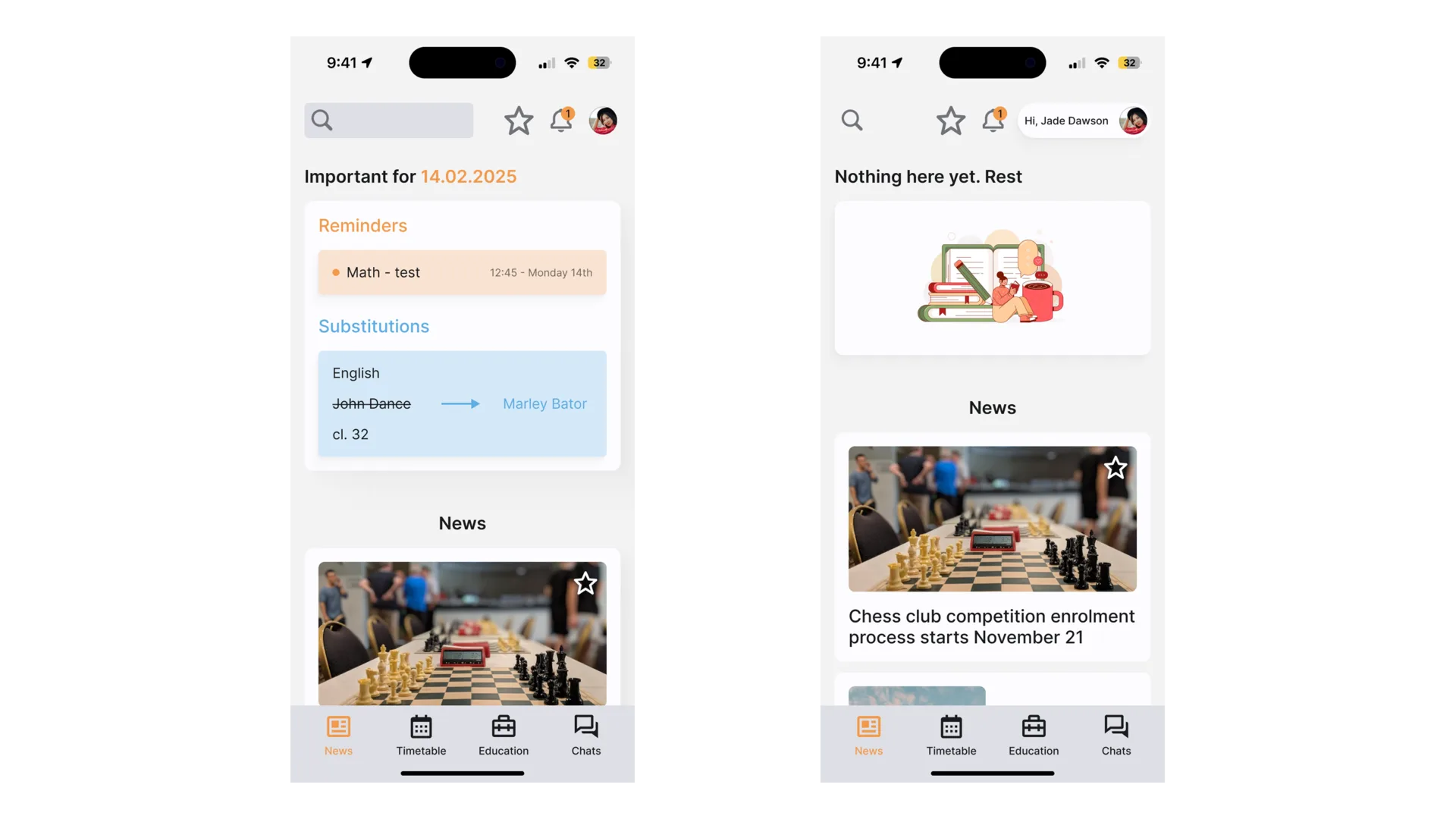
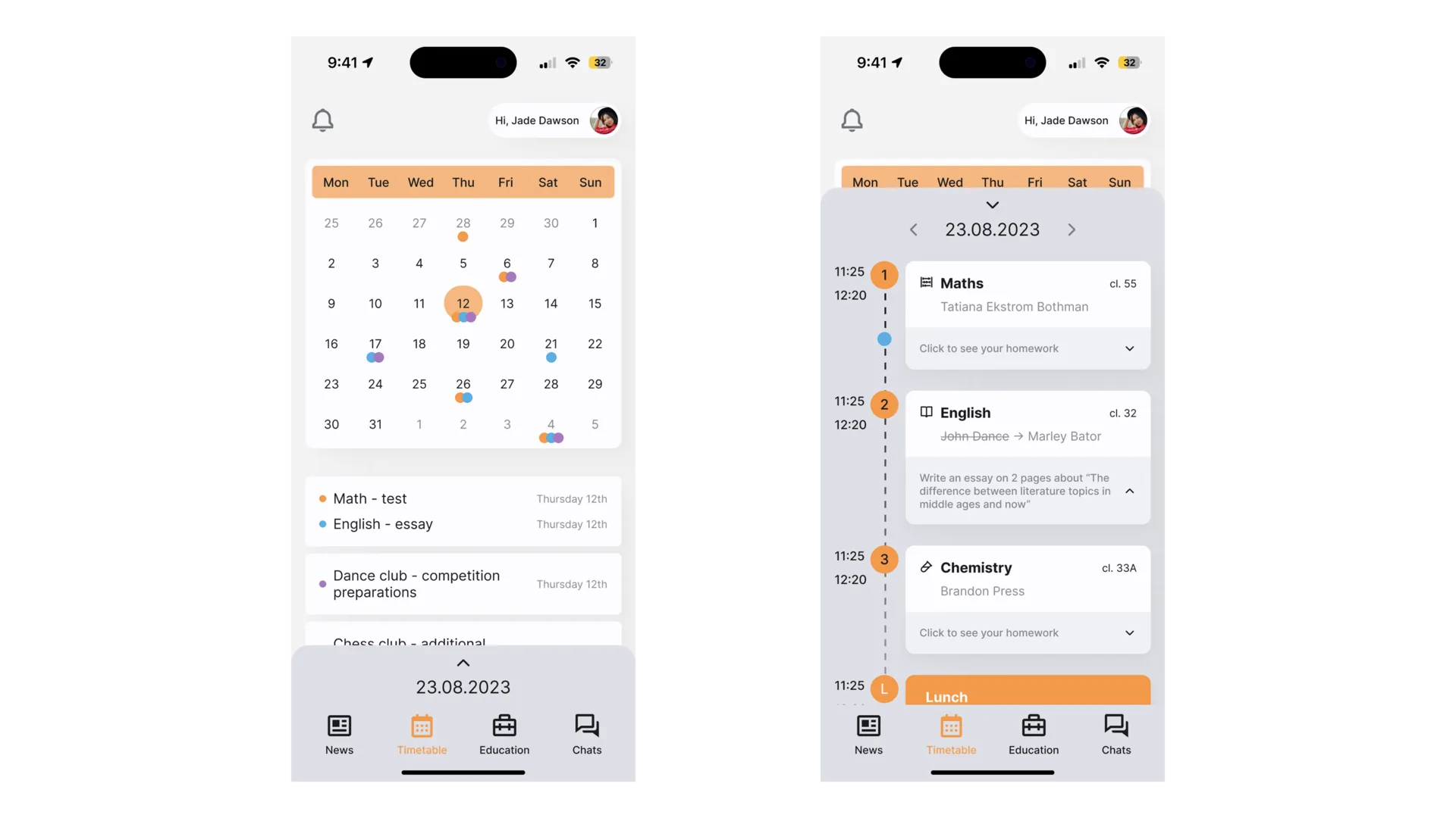
A Schedule That Supports Routine
The schedule section gives students both calendar-like overview and daily detail. Homework and lesson information stay close to the class they belong to, reducing the need to jump between screens.
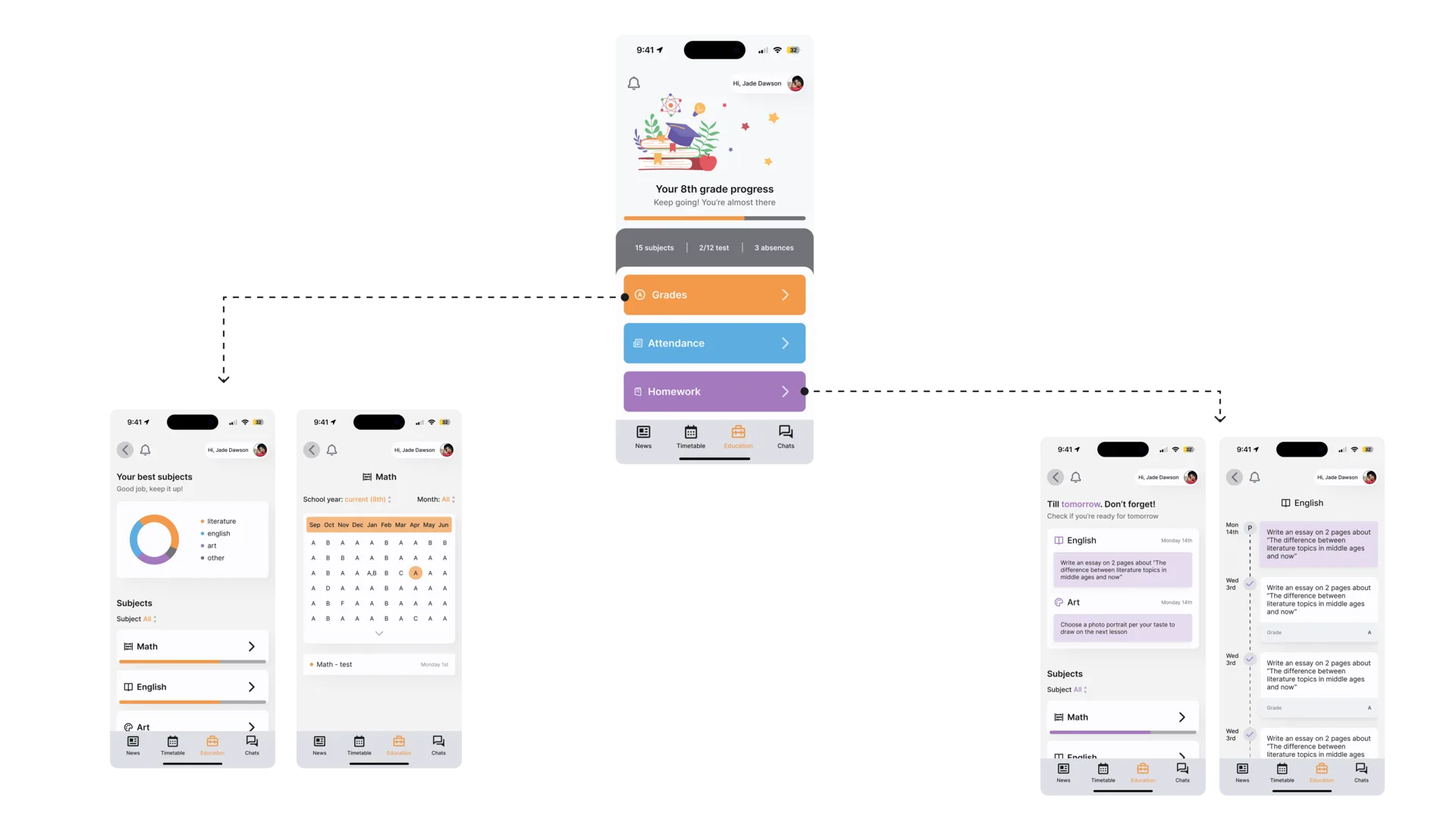
Learning Progress in One Place
The education section brings grades, homework, and study progress into one consistent layout. Color and hierarchy help students understand what needs attention first.
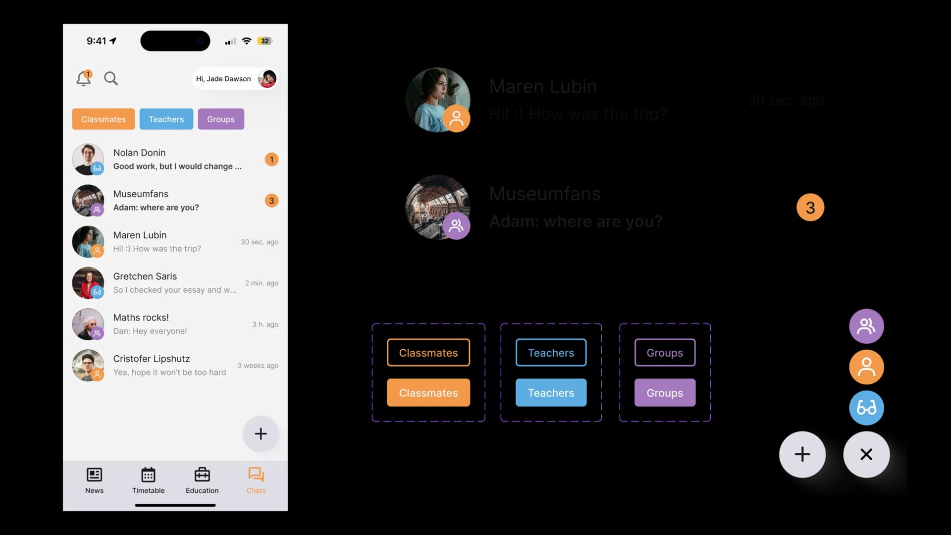
Communication Without Scattered Tools
The chat section keeps classmates, teachers, and groups in one place. Search, categories, and visual labels make conversations easier to find.
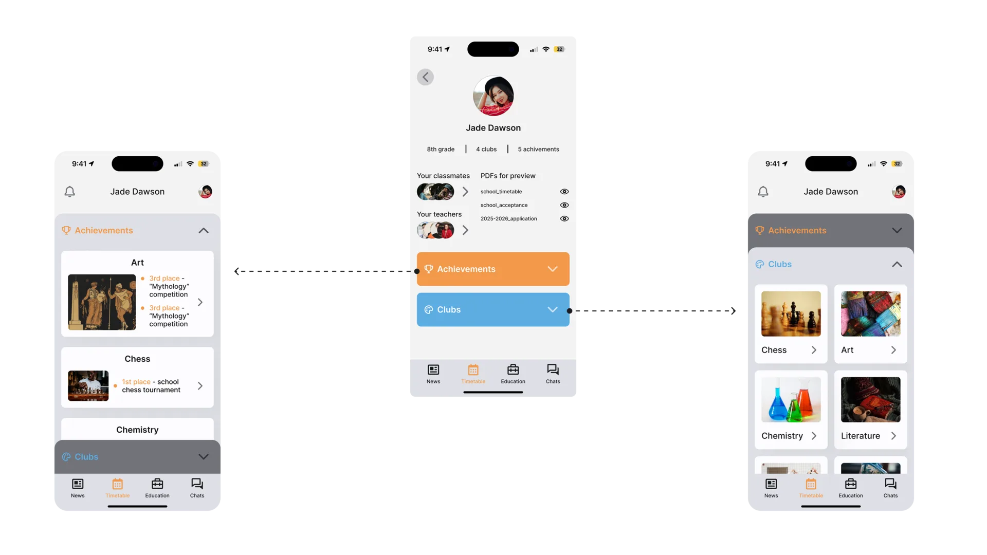
Profile as a Motivational Space
The profile connects achievements, clubs, and personal progress. Instead of being a static account page, it becomes a place where students can see what they have done and what they are building toward.
Combining Playfulness, Elegance, and Clarity
The final system focuses on clear navigation, consistent patterns, and small motivational moments. It keeps the interface light enough for daily use while still giving students a sense of progress.
Visual Clarity as the Key Outcome
Classmates responded most strongly to the clearer structure and visual separation of sections. The project taught me that designing for young users is less about adding playful details everywhere and more about making complex routines feel manageable.